Design does not stand still. What feels fresh and engaging today can quickly start to look ordinary as user preferences shift and new tools become available. Brands are paying closer attention to how their websites and digital products look because visual style now plays a major role in first impressions. It shapes trust, personality, and perceived quality within seconds. From bold typography and layered layouts to subtle motion and textured backgrounds, modern digital design is becoming more expressive and intentional. But following trends without strategy can create confusion instead of impact. This guide explores the visual styles gaining attention right now and explains how to apply them thoughtfully, so design decisions feel purposeful rather than temporary.
Emerging visual styles refer to the new design directions gaining attention across websites, apps, and digital platforms. These styles do not appear randomly. They are shaped by cultural shifts, new technologies, and changing user behavior. Social media aesthetics, design tools powered by AI, faster devices, and interactive frameworks all influence how digital experiences look and feel. At the same time, user expectations continue to grow as people interact daily with polished apps and immersive platforms.
Visual style is not just decoration layered on top of content. It communicates personality, builds trust, and signals innovation. The right visual direction helps brands stand out while supporting usability and clarity. When used strategically, visual styles strengthen identity rather than simply following trends.
Visual styles are shifting faster than before because the digital space itself keeps changing. Technology, culture, and user expectations are constantly influencing how brands present themselves online.
Advancements in technology have expanded what designers can realistically create. Tools powered by artificial intelligence can now generate images, layouts, and visual concepts in minutes. WebGL enables immersive graphics directly in the browser without heavy plugins. Real-time 3D rendering makes product presentations more interactive and detailed. Augmented reality allows users to visualize products in their own environment, blending digital and physical experiences. Motion frameworks make smooth animations easier to implement across devices.
As these technologies become more accessible, brands are quick to adopt them to appear modern and innovative. What was once considered complex or expensive is now achievable for many businesses. This rapid accessibility pushes visual standards higher. When audiences become familiar with interactive 3D visuals or dynamic interfaces, static designs start to feel outdated. Technology does not just enable new styles; it raises expectations.
Design trends are deeply connected to culture. Social media platforms constantly introduce new aesthetics, from bold typography to minimal layouts and vibrant gradients. Viral content spreads design inspiration instantly across the world. The creator economy also plays a role, as independent designers and content creators experiment publicly and influence mainstream styles.
Digital-native audiences, who have grown up with smartphones and immersive apps, expect visual variety and creativity. They respond to authenticity, personality, and uniqueness rather than generic templates. Cultural movements, online communities, and even memes shape color choices, typography preferences, and layout trends. As culture moves quickly, visual styles reflect that movement. Brands that ignore these shifts risk appearing disconnected from their audience.
Online competition is intense. Every website, ad, and app is competing for a few seconds of attention. Users scroll quickly, skim content, and decide almost instantly whether something is worth their time. This reality forces design to become more intentional and visually compelling.
Strong visual styles help capture interest in those first critical moments. Bold contrasts, layered depth, subtle motion, and distinctive typography can stop the scroll. In an environment where attention is limited, visual impact becomes essential. As a result, styles continue to change as brands search for new ways to stand out and hold user focus longer.
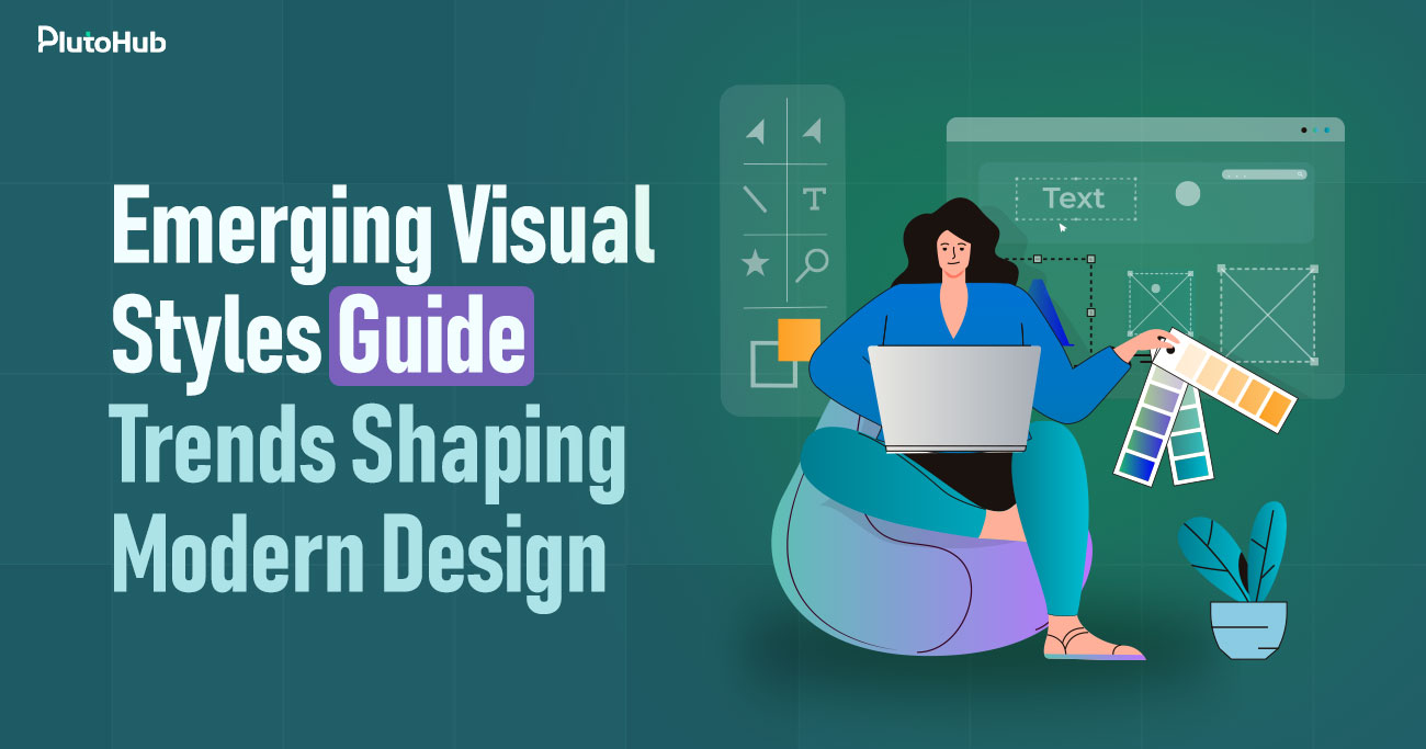
Design styles are becoming more expressive and intentional. Brands are not just choosing what looks attractive but what communicates personality, clarity, and confidence. Below are some of the most noticeable visual directions shaping modern digital experiences.
Minimalism has not disappeared, but it has matured. Instead of plain layouts with thin fonts and excessive white space, Minimalism 2.0 combines simplicity with bold expression. Designers are using strong typography, larger headlines, and confident spacing to create impact without clutter. The layout feels clean, yet not empty. Strategic white space is used to guide attention rather than just fill gaps. Color palettes are often limited but more intentional. This style works well for brands that want to communicate clarity, focus, and authority while still appearing modern and refined.
Typography is no longer just a supporting element. It often becomes the main visual feature. Oversized fonts, stretched letters, overlapping text, and unexpected alignments create personality. Some websites use kinetic typography where text subtly moves or reacts to scrolling. This approach brings energy to otherwise simple layouts. Experimental typography works especially well for creative brands, agencies, and fashion labels that want to express individuality. However, readability must remain a priority. When balanced correctly, expressive typography captures attention while still delivering clear messaging.
Three-dimensional visuals are becoming more common across websites and apps. Soft 3D objects, realistic product mockups, and detailed digital scenes create depth and realism. These elements can make a brand feel advanced and immersive. For product-based businesses, 3D visuals allow customers to see items from multiple angles, increasing confidence and engagement. Even abstract 3D shapes are used as decorative focal points to break flat layouts. The key is maintaining performance. When optimized properly, 3D elements add richness without slowing down the experience.
Glassmorphism introduces transparency and blur effects that create layered depth. Panels appear like frosted glass placed over colorful backgrounds. This style gives interfaces a soft, modern appearance. It feels clean but visually interesting due to the layered effect. Designers often combine subtle shadows and gradients to enhance the illusion of depth. Glassmorphism works particularly well in dashboards, fintech platforms, and tech-focused websites. It adds dimension while maintaining structure. When used thoughtfully, it creates a polished and contemporary feel.
Dark mode has moved from optional feature to primary design choice for many platforms. Dark backgrounds reduce eye strain, especially in low-light environments, and create a strong visual mood. Combined with high-contrast typography and accent colors, dark interfaces feel bold and focused. Many brands use dark themes to communicate sophistication or innovation. High contrast also improves readability when applied correctly. The balance lies in ensuring that text remains clear and visual hierarchy is preserved. Dark interfaces, when executed well, feel immersive and confident.
Retro-futurism blends nostalgic design elements with futuristic touches. Designers experiment with grainy textures, bold gradients, pixel-inspired graphics, and vibrant color schemes. Neo-brutalism takes a raw and unapologetic approach, using strong outlines, sharp edges, and minimal decoration. Both styles challenge traditional polish and create a bold visual identity. These approaches appeal to brands that want to stand out and avoid predictable layouts. They feel expressive, slightly rebellious, and highly memorable. The challenge is ensuring usability is not sacrificed for artistic impact.
AI-generated visuals are becoming more common in branding and web design. Custom illustrations, generative patterns, and unique imagery can now be created quickly and tailored to specific brand themes. This allows companies to move beyond generic stock photos. AI tools also enable adaptive visuals that respond to user preferences or data inputs. The advantage lies in originality and scalability. However, creative direction still matters. AI should support brand identity rather than replace thoughtful design decisions.
Subtle motion has become a key part of modern design. Micro-interactions, such as button feedback, hover effects, and smooth transitions, make interfaces feel responsive and intuitive. Motion-driven UI elements guide users naturally through a page. They can highlight changes, confirm actions, or direct focus to important sections. These small details improve usability and create a more polished experience. When used carefully, motion builds trust because the interface feels alive and interactive without overwhelming the user.
Visual style plays a major role in shaping how people perceive a brand. Before reading a single sentence, users form impressions based on layout, color, typography, and overall presentation. Emerging visual styles can strengthen identity when used intentionally and aligned with brand values.
Design directly affects how people feel. Color palettes, spacing, typography choices, and motion all contribute to emotional response. Soft gradients and rounded shapes may create a calm and welcoming atmosphere, while bold contrasts and sharp edges can feel confident and energetic. Emerging visual styles often experiment with mood-driven aesthetics that help brands communicate personality more clearly. When visual direction matches brand tone, it creates consistency. This emotional alignment makes users feel connected rather than confused. Strong emotional impact increases memorability because people tend to remember how a brand made them feel more than what it said.
Modern visual styles often signal progress and forward thinking. When a brand adopts thoughtful motion, layered depth, or expressive typography, it can appear more current and aware of digital standards. This perception matters, especially in industries like technology, finance, and startups where innovation is highly valued. Outdated visuals may create doubt about whether a company keeps up with industry developments. On the other hand, strategic use of modern design elements can communicate adaptability and confidence. The goal is not to follow every trend, but to select styles that reflect growth and awareness. Visual freshness supports the perception of innovation without overwhelming the user.
Trust is built through clarity and professionalism. Clean layouts, balanced spacing, and consistent visual systems make a website feel organized and reliable. Emerging styles can enhance trust when they are implemented carefully. For example, subtle motion and clear visual hierarchy guide users naturally through content. This reduces confusion and builds confidence. However, overused effects or chaotic layouts can have the opposite impact. Visual direction should support readability and structure. When design feels intentional rather than experimental for its own sake, credibility increases. Users are more likely to trust brands that appear polished and thoughtful.
Many industries are saturated with similar-looking websites. Emerging visual styles provide an opportunity to stand out. Unique typography, distinctive color schemes, or interactive elements can create a recognizable presence. Differentiation does not require extreme experimentation. Even small but consistent visual choices can separate a brand from competitors. The key is aligning style with identity. When visuals reflect brand values and audience preferences, they become a strategic advantage. Standing out is not just about being different. It is about being memorable for the right reasons.
Visual trends do not impact every industry in the same way. Different sectors adopt styles that reflect their audience expectations, product complexity, and brand positioning. What works for a startup may not suit a SaaS dashboard, and what feels bold for an agency might overwhelm an online store. Understanding these industry-specific shifts helps brands apply emerging styles with purpose rather than imitation.
Tech startups often lean toward futuristic visuals to communicate innovation and ambition. Gradients with vibrant transitions, glowing accents, and abstract 3D shapes are commonly used to create depth and movement. These elements suggest forward thinking and advanced technology. Clean layouts combined with layered visuals give the impression of scalability and sophistication. Many startups also use dark themes or high-contrast designs to reinforce a modern tone. The goal is to look visionary without appearing complicated. When executed properly, these visual choices signal confidence and help attract early adopters who expect cutting-edge presentation.
E-commerce platforms are focusing more on immersive product storytelling. Instead of simple product grids, brands are using interactive previews, zoom features, and dynamic galleries. High-quality visuals, lifestyle imagery, and subtle motion effects help customers feel closer to the product. Some stores incorporate 3D product views or hover-based interactions that reveal details instantly. This approach builds trust and reduces hesitation during purchasing decisions. Clear spacing and guided scrolling also play a role in improving usability. The shift is toward making online shopping feel engaging and informative rather than transactional and flat.
SaaS platforms prioritize clarity and functionality, but that does not mean design is overlooked. Modern SaaS visuals often feature clean dashboards, soft shadows, and structured layouts. Subtle motion is used to provide feedback, confirm actions, or highlight data changes. Instead of bold experimentation, the focus is on simplicity and ease of navigation. Color is applied strategically to indicate status, alerts, or key metrics. The visual shift in SaaS design aims to reduce cognitive load while maintaining a polished appearance. Users should feel in control and confident while interacting with the interface.
Creative agencies have more freedom to experiment with visual styles. Bold typography, unconventional layouts, and unexpected color combinations are common. Agencies often use expressive design to demonstrate their capabilities and artistic range. Overlapping text, dramatic spacing, and strong contrasts help create memorable first impressions. Motion and interactive elements are also used to showcase technical skills. The goal is differentiation and personality. While creativity takes center stage, usability still matters. The most effective agency websites balance artistic expression with smooth navigation and clear messaging.
Adopting new visual styles can refresh a brand, but relying too heavily on trends can make a design feel outdated quickly. The challenge is finding balance. Strong design decisions should feel current without losing long-term relevance. Brands that manage this balance well create experiences that remain effective even as trends shift.
One common mistake is adding too many trendy elements at once. Gradients, bold typography, motion effects, and layered visuals may each look impressive individually, but combining them without restraint can create clutter. Overdesign distracts from content and weakens clarity. Instead, trends should support the message, not dominate it. Limiting visual experimentation to specific sections or highlights helps maintain structure. Simplicity often strengthens impact. When design feels controlled and intentional, it appears more refined and professional.
Not every trend deserves immediate adoption. Before applying a new style, brands should consider whether it aligns with their identity and audience. A design that feels exciting today may not reflect long-term values. Timeless elements such as balanced layouts, readable typography, and consistent spacing rarely lose relevance. Trends can be layered on top of this strong foundation. By building around core design principles, brands ensure that updates enhance rather than replace their identity. Longevity comes from thoughtful selection, not rapid change.
Experimentation is important for growth, but it should be strategic. Landing pages, campaign microsites, or limited product launches are good spaces to test emerging styles. These areas allow creative freedom without affecting the entire brand ecosystem. Monitoring user feedback and engagement metrics can reveal whether a style improves experience or causes confusion. Small-scale experimentation reduces risk while encouraging innovation. Controlled testing keeps creativity aligned with performance goals.
No trend should compromise usability. Clear navigation, readable contrast, and accessible motion settings must remain priorities. High visual impact means little if users struggle to interact with the site. Accessibility considerations such as keyboard navigation and reduced motion preferences ensure inclusivity. When design balances creativity with clarity, it supports both modern appeal and practical function.
Digital design continues to shift as new tools and user expectations reshape how people interact with screens. The next phase is less about decoration and more about depth, personalization, and presence. Visual design is moving toward experiences that feel responsive, intelligent, and immersive rather than static and predictable.
Websites are starting to feel more like environments than pages. Advanced browser capabilities allow layered visuals, dynamic lighting effects, interactive 3D objects, and seamless transitions between sections. Instead of scrolling through flat content, users explore spaces that respond to movement and interaction. These immersive experiences are especially powerful for storytelling, product showcases, and brand launches. However, performance and accessibility must remain priorities. The goal is not to overwhelm users but to create a sense of presence. When immersive elements are balanced with clarity, they make digital interaction more engaging and memorable.
Artificial intelligence is influencing not only how designs are created but how they adapt. Interfaces can now adjust content, visuals, and layout based on user behavior and preferences. Personalized dashboards, dynamic recommendations, and adaptive imagery are becoming more common. This approach allows brands to deliver experiences that feel tailored rather than generic. As AI tools become more integrated into design systems, visual presentation may shift in real time. The challenge will be maintaining consistency while allowing flexibility. Personalized interfaces should enhance clarity and relevance without confusing users with constant change.
Spatial design, influenced by 3D environments and gaming interfaces, is shaping how digital layouts are structured. Designers are thinking beyond flat grids and considering depth, layering, and perspective. Elements may overlap naturally, cast subtle shadows, or move within defined spaces to create dimension. This approach makes interfaces feel more intuitive because they mimic physical environments. As hardware and browser rendering improve, spatial thinking will likely become more common. Depth will be used not just for decoration but for guiding hierarchy and interaction.
Mixed reality technologies are inspiring new visual directions. Even if users are not wearing headsets, the influence of augmented and virtual reality is visible in web and app design. Transparent layers, floating panels, and immersive backgrounds reflect this inspiration. Designers are borrowing ideas from virtual environments to create more engaging digital spaces. As mixed reality becomes more mainstream, its visual language may further shape how websites and applications are designed, blending physical and digital aesthetics more seamlessly.
PlutoHub does not follow trends for the sake of appearance. Every visual decision starts with research. User behavior, audience expectations, and industry positioning are carefully analyzed before any new style is introduced. This ensures that design choices are guided by purpose rather than popularity.
Before adopting an emerging visual direction, PlutoHub evaluates how it aligns with the brand’s identity. Typography, color systems, motion, and layout must reflect core values and long-term positioning. Trends are adapted, not copied.
Visual design is always tied to conversion goals. Aesthetics guide attention, support messaging, and strengthen calls to action. At the same time, all visuals are optimized for speed and responsiveness. Sustainable design systems ensure consistency and long-term scalability.
There is no fixed timeline for updating visual style. Changes should be based on strategic needs rather than pressure to follow trends. If the current design no longer reflects the brand’s positioning, audience expectations, or industry standards, it may be time for refinement. Small, gradual updates often work better than complete redesigns. Consistency builds recognition, so changes should feel like natural progress rather than sudden shifts.
Yes, but with moderation. Traditional industries such as finance, healthcare, or legal services can benefit from modern visuals when applied carefully. Clean layouts, subtle motion, and thoughtful typography can refresh a brand without reducing credibility. The key is maintaining professionalism while introducing contemporary elements that enhance clarity and engagement.
Bold design does not automatically harm usability. Problems occur when style overpowers structure. As long as navigation is clear, text is readable, and interactions are intuitive, expressive visuals can strengthen engagement. Balance is essential.
Small businesses can start with focused updates, such as improving typography, refining color palettes, or adding subtle motion effects. Strategic adjustments often create strong impact without requiring a full redesign.
Trends can age quickly if used excessively. Building on timeless design foundations helps maintain long-term relevance while allowing room for modern accents.
Clear structure, consistent design systems, and thoughtful presentation create a sense of professionalism. When a website feels organized and intentional, users are more likely to trust the brand behind it.


Mahamudul Kabir
Leave a Reply