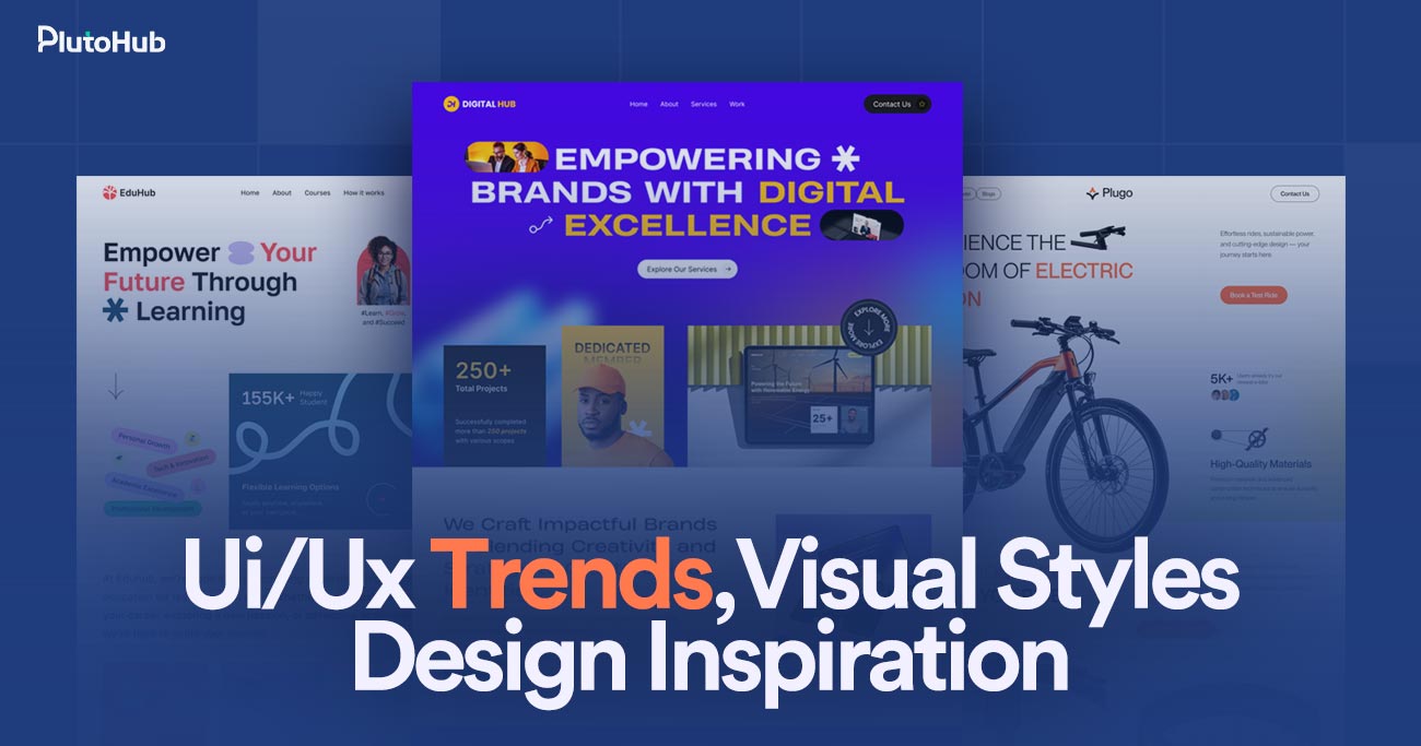
Modern websites are no longer just about looking good. They are built to guide users, create smooth experiences, and support clear business goals. As user behavior and technology continue to evolve, UI/UX trends and visual design styles play a major role in how people interact with digital products. From clean layouts and thoughtful interactions to creative scrolling patterns and bold visual choices, modern design shapes how brands are perceived online.
Staying updated with design inspiration helps businesses and designers create websites that feel intuitive, engaging, and relevant. In this guide, we explore key UI/UX trends, emerging visual styles, and creative design ideas that are shaping modern websites and influencing how users connect with brands in today’s digital world.
UI/UX design is about how a website or app looks, feels, and works for real people. UI, or user interface, focuses on the visual side like colors, fonts, buttons, and layouts. UX, or user experience, is about how easy and enjoyable it is for someone to use the product. It looks at things like navigation, page flow, speed, and how quickly users can find what they need. Good UI/UX design makes users feel comfortable, confident, and in control. When done well, people don’t have to think too hard, everything just feels natural. At its core, UI/UX design is about designing with users in mind and creating experiences that are simple, helpful, and enjoyable to use.
UI/UX trends change quickly because the digital world never stands still. New technology, user behavior, and expectations constantly reshape how people interact with websites and apps every day.
Technology moves incredibly fast, and UI/UX design has to keep up. New devices, screen sizes, browsers, and tools appear regularly. Features that felt advanced a few years ago can feel outdated today. Faster internet, better hardware, and modern frameworks allow designers to create smoother and more interactive experiences. As technology improves, users expect websites and apps to feel faster, smarter, and easier to use. This constant evolution pushes designers to adapt quickly and rethink how interfaces should work.
Users are exposed to great digital experiences every day. When people use well designed apps or websites, their expectations increase everywhere else. If one platform feels slow, confusing, or outdated, users notice immediately. What once felt impressive becomes normal very quickly. This forces designers to follow new trends that improve clarity, speed, and ease of use. UI/UX trends change fast because users expect better experiences with less effort every time they interact with a product.
Design inspiration spreads faster than ever through social media, design platforms, and online communities. A new layout style, animation trend, or visual approach can become popular almost overnight. Designers across the world see, test, and adapt these ideas quickly. As trends spread, users become familiar with them, which pushes designers to either improve on them or move on to something new. This rapid sharing cycle accelerates how fast UI/UX trends rise and fade.
Businesses rely heavily on digital products to attract and convert users. When competitors improve their UI/UX, others must follow or risk falling behind. Design trends often shift to support better conversions, engagement, and retention. A trend that improves user flow or reduces friction quickly gains attention. As markets become more competitive, businesses push designers to experiment and innovate, which speeds up changes in UI/UX approaches.
How people use the internet keeps changing. Mobile usage, voice search, touch interactions, and accessibility needs all influence design decisions. Shorter attention spans and faster decision making require clearer layouts and simpler interfaces. Designers adjust trends based on how users actually behave, not just how designs look. As behavior changes, design trends evolve to match those habits, making UI/UX a constantly moving target rather than a fixed set of rules.
UI/UX design continues to evolve as technology and user behavior change. In 2026, trends focus more on clarity, inclusivity, and smarter experiences that feel natural, fast, and deeply user centered.
Designers are prioritizing accessibility more than ever in 2026. Websites are being built for people with different abilities, devices, and situations. Clear contrast, readable text, keyboard navigation, and screen reader support are becoming standard, not optional. This shift is driven by awareness, regulations, and real user needs. Accessible design also improves usability for everyone, not just users with disabilities. Businesses are realizing that inclusive experiences lead to wider reach, better engagement, and stronger trust, making accessibility a core UI/UX trend rather than a secondary consideration. It also reduces friction and supports long term digital growth.
Personalization is becoming smarter and more subtle in 2026. Instead of aggressive customization, interfaces now adapt quietly based on behavior, context, and preferences. Content, layouts, and recommendations change to feel helpful, not intrusive. AI helps designers predict user needs and reduce unnecessary steps. The goal is to make experiences feel intuitive without users noticing the technology behind them. When done well, personalized UX saves time, increases satisfaction, and makes digital products feel more human and responsive to individual users. This approach also supports conversions while respecting privacy expectations and building long lasting customer relationships.
Minimal design continues to evolve in 2026, focusing more on purpose than appearance. Clean layouts are paired with strong hierarchy and clear intent. Every element must earn its place on the screen. Designers remove distractions to help users focus on key actions. White space, simple typography, and thoughtful spacing improve readability and reduce cognitive load. This trend is not about emptiness but about clarity, helping users move faster and feel more confident while navigating digital experiences. It also improves performance, accessibility, and consistency across devices and platforms, which is critical for modern product success.
Motion and microinteractions play a bigger role in modern UX during 2026. Small animations guide users, confirm actions, and provide feedback. Instead of decoration, motion now serves a clear function. Hover effects, loading states, and transitions help users understand what is happening. When used carefully, motion makes interfaces feel alive and responsive. Poorly used animation can distract users, so designers focus on balance, speed, and purpose rather than flashy effects. This trend improves usability while adding personality and emotional connection to digital experiences when motion is subtle, fast, and meaningful for everyday product interactions.
Design systems and consistency are becoming essential UI/UX trends in 2026. As products grow, maintaining consistency becomes harder. Design systems provide shared rules, components, and patterns that keep experiences unified. This improves usability and speeds up design and development. Users benefit from familiar interactions across pages and features. For businesses, design systems reduce errors and support scalability. Consistency builds trust and helps users feel comfortable as they move through complex digital products. They also improve collaboration between teams and ensure long term design quality across updates, platforms, and future expansions as products continue to evolve.
UI/UX trends do more than shape how websites look. They directly influence how users think, behave, and decide to take action, making design a powerful driver of engagement and conversions.
Modern UI/UX trends focus heavily on simplicity and clarity. When interfaces are easy to understand, users spend less time figuring things out and more time taking action. Clear layouts, readable text, and intuitive navigation reduce friction. This makes users feel comfortable and confident instead of confused. When friction is low, people are more likely to stay longer, explore more pages, and complete actions like signing up or making a purchase. Small usability improvements often lead to noticeable conversion gains.
Good UI/UX trends help guide users naturally through a page. Visual hierarchy uses spacing, size, color, and placement to show what matters most. Users tend to scan pages quickly, not read every word. Clear headings, strong call to action buttons, and focused sections tell users where to look and what to do next. When attention is guided properly, users are less likely to miss important information. This directly improves clicks, form submissions, and overall engagement.
Users judge websites very quickly. A modern, clean design builds trust almost instantly, while an outdated or cluttered interface can create doubt. UI/UX trends like consistent design, professional visuals, and smooth interactions make a website feel reliable. Trust plays a huge role in conversions, especially for new visitors. When users feel confident in a brand, they are more willing to share information, subscribe, or complete purchases without hesitation.
Speed focused UI/UX trends strongly influence user behavior. Fast loading pages, smooth transitions, and responsive interactions keep users engaged. Slow or laggy experiences frustrate users and increase bounce rates. Modern design trends emphasize performance by reducing unnecessary elements and optimizing interactions. When websites feel fast and responsive, users are more likely to continue their journey instead of leaving. Speed directly affects conversion rates, especially on mobile devices where patience is limited.
UI/UX trends also influence how users feel. Thoughtful colors, friendly microinteractions, and human centered design create positive emotional responses. When users enjoy using a website, they are more likely to trust it and return. Emotional connection can turn casual visitors into loyal users. Design that feels welcoming and intuitive encourages users to take action without pressure, which leads to stronger and more sustainable conversions over time.
Creative website scrolling patterns are design techniques that change how users move through a webpage. Instead of only using traditional top to bottom scrolling, designers use movement, animations, and layout shifts to create more engaging experiences. These patterns can include horizontal scrolling, parallax effects, scroll triggered animations, or section based storytelling.
The goal is to make content feel more interactive and guide users naturally through information. When used well, creative scrolling keeps users interested and encourages them to explore further. It can also help highlight important messages or visuals at the right moment. However, these patterns must feel smooth and intuitive, otherwise they can confuse users and harm usability instead of improving the experience.
Scrolling plays a bigger role in user experience than most people realize. In modern UX, it shapes how users consume content, stay engaged, and move smoothly through digital experiences.
Most people don’t think about scrolling because it feels automatic. From social media to news sites, users are trained to scroll without effort. Good UX design embraces this habit instead of fighting it. When content flows naturally as users move down the page, it reduces friction and makes the experience feel familiar. Users stay relaxed and focused instead of stopping to figure out what to do next. This comfort helps keep them engaged and willing to continue exploring.
Modern scrolling patterns allow designers to control timing. Instead of showing everything at once, content appears gradually as users move forward. This creates a clear flow and prevents information overload. Important messages, visuals, or actions can be introduced when users are ready for them. This approach makes content easier to understand and more memorable. When information is delivered in the right order, users feel guided rather than overwhelmed.
Well designed scrolling adds a sense of movement and interaction. Subtle animations, transitions, or visual changes triggered by scrolling can make a website feel alive. This encourages users to keep going out of curiosity. The experience feels more interactive than static pages. When users stay engaged longer, they are more likely to absorb information, trust the brand, and take meaningful actions. The key is balance, keeping it engaging without becoming distracting.
On mobile devices, scrolling is the main way people interact with websites. Buttons and menus matter, but scrolling does most of the work. Modern UX design prioritizes vertical flow that works comfortably on small screens. Proper spacing, readable sections, and smooth scrolling improve comfort and reduce strain. When scrolling feels smooth on mobile, users are more likely to stay, read, and interact instead of leaving quickly.
Scrolling patterns help guide attention without forcing it. Designers use spacing, visual cues, and motion to highlight important sections as users move down the page. This naturally draws focus to key messages, features, or calls to action. Users feel led instead of pushed. When guidance feels subtle and natural, people are more confident in their decisions, which improves engagement and conversion outcomes.
Website scrolling patterns shape how users move through content and experience a page. Different scrolling styles influence engagement, storytelling, usability, and how comfortably users interact with modern websites.
Vertical scrolling is the most familiar and widely used pattern. Users naturally scroll from top to bottom without thinking. This pattern works well for blogs, landing pages, and content heavy websites. It is simple, predictable, and easy to control. Designers can organize content in clear sections that stack naturally. Because users understand this pattern instantly, it creates very little friction. Vertical scrolling also works smoothly across devices, especially on mobile. For most websites, it remains the safest and most user friendly scrolling option.
Horizontal scrolling moves content sideways instead of vertically. It is often used for galleries, portfolios, or storytelling sections where visuals matter more than text. When done well, it feels creative and engaging. However, horizontal scrolling can confuse users if it replaces vertical scrolling completely. Most users expect vertical movement, so designers must provide clear cues and smooth interactions. This pattern works best when used intentionally and in limited sections rather than across an entire website.
Parallax scrolling creates a sense of depth by moving background and foreground elements at different speeds. This adds visual interest and makes pages feel more immersive. Parallax is often used in storytelling or brand focused websites to create emotional impact. While visually appealing, it must be used carefully. Heavy parallax effects can slow performance or cause motion discomfort for some users. When balanced well, parallax enhances storytelling without harming usability.
Scroll triggered animations reveal content as users move down the page. Text, images, or elements appear, fade, or slide into view at the right moment. This keeps users engaged and prevents information overload. Animations can highlight key points and guide attention naturally. However, too many animations can feel distracting or slow. The goal is to support content, not compete with it. Subtle and purposeful animations work best.
Infinite scrolling automatically loads more content as users reach the bottom of a page. This pattern is common on social media and content heavy platforms. It keeps users engaged without interruption. Smart scrolling improves on this by grouping or pausing content to avoid fatigue. While effective for discovery, infinite scrolling can make navigation and content retrieval harder. Designers must balance engagement with control to ensure users do not feel lost or overwhelmed.
Visual styles in web design continue to evolve as brands look for new ways to stand out and connect with users. Emerging styles focus on clarity, emotion, and stronger visual identity.
Minimal design is evolving into something warmer and more expressive. Clean layouts are combined with soft colors, gentle shadows, and subtle depth. This style keeps interfaces simple while avoiding a cold or empty feel. Designers use spacing and typography carefully to create calm, comfortable experiences. The focus is on clarity, but with personality that reflects the brand. Soft minimalism works well for modern businesses that want to feel professional yet approachable at the same time.
Typography is taking center stage in modern web design. Large headlines, unique fonts, and creative text placement are used to grab attention quickly. This style helps communicate brand tone instantly and makes content more memorable. Expressive layouts break traditional grids while still maintaining balance and readability. When done well, bold typography creates strong visual impact without sacrificing usability. It works especially well for storytelling, creative brands, and landing pages focused on clear messaging.
Modern websites are using depth to create more engaging visuals. Techniques like subtle shadows, gradients, glass like effects, and layered elements add dimension without overwhelming users. These effects help separate content and guide attention naturally. When used lightly, they make interfaces feel more polished and interactive. The key is restraint. Too much depth can distract users or hurt performance. Balanced visual effects enhance experience while keeping interfaces clean and usable.
Custom illustrations and graphics are becoming more popular as brands move away from generic stock imagery. Hand drawn elements, icons, and visual storytelling help create a unique identity. Illustration driven design adds personality and makes brands feel more human. These visuals can explain ideas quickly and create emotional connections. When aligned with brand tone, custom visuals make websites more memorable and engaging while supporting clarity and user experience rather than overpowering it.
Visual design is often the first thing people notice about a brand online. Before reading content or exploring features, users form opinions based on how a website looks and feels.
People judge websites very quickly, often within seconds. Visual design styles set the tone before users read a single word. Colors, typography, spacing, and layout immediately signal whether a brand feels professional, modern, trustworthy, or outdated. A clean and consistent visual style creates confidence, while cluttered or outdated visuals can raise doubt. Even if a business offers great products or services, poor visual design can weaken that message. First impressions are emotional, and visual design plays the biggest role in shaping them.
Design styles help express who a brand is without saying it directly. Bold visuals can feel confident and energetic, while soft and minimal designs often feel calm and approachable. Fonts, colors, and imagery work together to communicate personality and values. When visual choices match the brand’s voice and audience, users feel a stronger connection. If the style feels mismatched or inconsistent, the brand can seem unclear or untrustworthy. Strong visual design helps users quickly understand what a brand stands for.
Consistent visual design across pages and platforms helps users recognize and trust a brand. When colors, typography, and layouts feel unified, the experience feels reliable and intentional. Inconsistent visuals can confuse users and make a brand appear unorganized. Over time, consistency builds familiarity, and familiarity builds trust. Users are more likely to return, engage, and convert when a brand looks and feels the same wherever they interact with it. Visual consistency turns design into a long term trust building tool.
Visual design directly affects how comfortable users feel when taking action. Clear layouts, readable text, and thoughtful spacing reduce stress and confusion. When users feel comfortable, they are more likely to explore, trust information, and make decisions. Poor visual design can make users hesitate or leave without engaging. Strong visual styles guide attention and create a sense of professionalism that reassures users. This confidence plays a major role in how users perceive a brand and whether they choose to engage with it further.
Choosing the right UI/UX trends is about more than following what looks popular. The best trends support your users, fit your brand, and help your project achieve clear business goals.
Before choosing any UI/UX trend, think about who your users are and what they need. Different audiences respond differently to design choices. A complex, animated interface might work for a creative brand but frustrate users on a service website. Understanding user behavior, expectations, and pain points helps you avoid trends that look good but hurt usability. When design decisions are based on real user needs, trends become tools rather than distractions.
Every design choice should support a goal. If your aim is lead generation, clarity and strong calls to action matter more than visual experiments. If branding and storytelling are priorities, creative visuals may play a larger role. UI/UX trends should enhance what you are trying to achieve, not compete with it. When trends align with business goals, they contribute directly to conversions, engagement, and growth instead of just adding visual flair.
Not every trend matches every brand. Colors, typography, motion, and layout should reflect your brand’s personality and tone. A serious, professional brand may benefit from clean and minimal design, while a bold brand might embrace expressive visuals. Following trends that clash with your identity can confuse users. The right UI/UX trends should strengthen brand recognition and make your website feel authentic rather than forced or trendy for the sake of it.
No trend should come at the cost of usability or speed. Heavy animations, complex interactions, or experimental layouts can slow down performance and frustrate users. Always test how trends affect loading time, navigation, and accessibility. A good UI/UX trend improves the experience instead of making users work harder. If a trend hurts clarity or performance, it is better to skip it. Practical design always wins over visual complexity.
Trends change quickly, but websites are built to last. Choose UI/UX trends that will age well and remain useful over time. Avoid overly specific styles that may feel outdated within a year. Focus on principles like clarity, consistency, and accessibility, which stay relevant. When trends are used thoughtfully and combined with strong fundamentals, your design remains effective even as trends continue to evolve.
UI/UX trends can improve design and user experience, but following every trend is not always the right move. Knowing when to use trends and when to avoid them is key.
UI/UX trends are worth following when they clearly make things easier for users. Trends like better accessibility, cleaner layouts, or improved mobile experiences directly help people navigate and understand a website. When a trend reduces friction, saves time, or improves clarity, it adds real value. These trends usually focus on usability rather than appearance. If users can complete tasks faster or feel more comfortable using your site, the trend is doing its job. In these cases, following trends helps keep your website modern and user friendly.
Trends work best when they support what your business is trying to achieve. If your goal is conversions, trends that improve focus and guide attention can be helpful. If branding is important, visual trends that strengthen identity may make sense. When a trend supports engagement, trust, or growth, it becomes a strategic choice rather than a design experiment. Using trends with purpose helps your website perform better instead of just looking updated.
Not all trends are good for every project. Some design trends look impressive but make websites harder to use. Heavy animations, complex layouts, or unusual navigation can confuse users and slow down performance. If a trend makes users think too much or wait longer, it should be avoided. Usability and speed should always come first. A website that looks trendy but feels frustrating will lose users quickly.
Every brand has its own personality, tone, and audience. A trend that works for a creative startup may feel out of place for a professional or service based business. Following trends that clash with your brand can confuse users and weaken trust. Design should feel natural and authentic. If a trend does not match your brand values or audience expectations, it is better to skip it, even if it is popular.
The best approach is balance. Trends change fast, but good design principles stay relevant. Clarity, consistency, accessibility, and simplicity never go out of style. Use trends to enhance these fundamentals, not replace them. When trends are applied lightly and thoughtfully, they keep your website fresh without making it feel temporary. A balanced approach helps your design stay effective today and still feel relevant tomorrow.
Even experienced designers can fall into common UI/UX and visual design traps. These mistakes often look small at first but can seriously affect usability, trust, and overall user experience.
One of the most common mistakes is focusing too much on how a design looks and not enough on how it works. Beautiful visuals mean nothing if users struggle to navigate or complete tasks. Overdesigned layouts, confusing navigation, or hidden actions can frustrate users quickly. Design should support users, not impress them at the cost of clarity. When usability is ignored, users feel lost and leave. Good UI/UX design balances aesthetics with function, making sure every visual choice helps users move forward easily and confidently.
Many designers still design primarily for desktop screens and treat mobile as an afterthought. This leads to cramped layouts, tiny text, and difficult interactions on smaller devices. Since most users browse on mobile, this mistake can seriously hurt engagement and conversions. Responsive design is not optional anymore. Interfaces should feel comfortable and natural on all screen sizes. Ignoring mobile users sends the message that their experience is not important, which can damage both trust and performance.
Trends can be exciting, but using too many at the same time often creates chaos. Mixing bold typography, heavy animations, unusual layouts, and strong colors can overwhelm users. Instead of feeling modern, the design feels noisy and confusing. Trends should be used selectively and with purpose. When everything is emphasized, nothing stands out. A cleaner approach allows users to focus and understand content more easily. The best designs use trends to enhance clarity, not compete for attention.
When everything looks equally important, users do not know where to look. Poor visual hierarchy is a common mistake that leads to confusion. Long blocks of text, weak headings, and inconsistent spacing make content hard to scan. Users typically skim rather than read, so structure matters. Clear headings, spacing, and contrast help guide attention naturally. Without strong hierarchy, users feel overwhelmed and may miss key information or actions. Good structure turns content into a clear, enjoyable experience.
Designers sometimes forget that not everyone uses websites the same way. Poor contrast, small fonts, unclear buttons, and missing accessibility features can exclude many users. Accessibility is not just about compliance, it is about empathy. When designers ignore accessibility, they limit who can use the product comfortably. Simple choices like readable text, clear labels, and keyboard friendly navigation make a big difference. Designing for real users with different needs creates better experiences for everyone.
Plutohub applies UI/UX trends and visual styles with a clear focus on strategy, not hype. Instead of following trends blindly, the team starts by understanding business goals, target users, and real usability needs. Trends are selected only when they improve clarity, engagement, and performance. Visual styles are chosen to match brand personality and build trust, not just to look modern. Plutohub balances creativity with usability, ensuring designs remain intuitive, fast, and accessible.
By combining proven design principles with carefully chosen trends, Plutohub creates websites that feel current while staying practical and scalable. This strategic approach helps businesses stand out visually while delivering meaningful user experiences that support long term growth and conversions.
UI/UX trends do not need constant updates. Most websites benefit from reviewing design every two to three years. Small improvements can be made earlier, but full updates should be driven by performance, not trends alone.
No, trends affect industries differently. A creative brand may benefit from bold visuals, while professional or service based businesses often need clarity and simplicity. Trends should always match audience expectations.
Yes. Using too many trends can confuse users and reduce clarity. When design becomes overwhelming, users hesitate. Conversions improve when trends are used carefully to support usability and clear actions.
Usability always comes first. Trends should support usability, not replace it. A simple, usable design will outperform a trendy design that is difficult to navigate or understand.
Indirectly, they have a strong impact. Better usability, faster load times, and improved engagement help SEO. Trends that slow down performance or confuse users can harm search visibility.
Not always. Many trends focus on simplicity, accessibility, and clarity, which do not require heavy development. Strategic improvements often deliver more value than expensive visual changes.
Plutohub evaluates user behavior, business goals, and technical performance before applying trends. Only trends that improve clarity, usability, and long term value are used, ensuring design decisions remain strategic and results driven.


Mahamudul Kabir
Leave a Reply