Design is one of the most powerful ways an agency can express its identity online. A website is often the first place potential clients visit, and the design quickly sets the tone for trust and professionalism.
In 2025, agency websites are expected to do more than showcase portfolios. They need to deliver smooth performance, reflect strong branding, and engage visitors with creativity and clarity. From minimal layouts to immersive storytelling features, each design choice makes a difference in how people experience a brand.
In this article, we will explore 18 inspiring agency website design ideas, each supported by real examples, to help you create a digital presence that looks modern, feels engaging, and stands out in a competitive industry.
Agencies need websites that stand out and speak for themselves quickly. These four design approaches help tell a brand's story, convey a professional feel, and remain creative. Each idea explains why it works and includes a real-world example for inspiration.
Parallax scrolling makes the background move more slowly than the foreground as users scroll. This creates a feeling of depth and invites users to keep exploring. It turns visiting a site into an interactive journey rather than just reading.
Why it matters
This style makes your site feel like a story unfolding under the visitor's eyes. It adds an emotional pull that can capture attention, encourage more extended visits, and give your agency a modern feel.
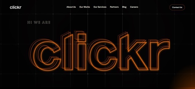
Example – Clickrs Agency
Clickrs show project visuals with subtle parallax movement. As you scroll, images shift into view while text fades out. The result is focused, visually clean storytelling that grabs attention without overwhelming.
Minimalism focuses only on what matters most. When bold typography anchors that simplicity, the message stands out loud and clear. Visitors are not distracted and understand the core ideas instantly.
Why it matters
A minimal layout with significant type grabs attention quickly. It feels intentional and confident while remaining elegant. The design says that your agency knows how to make bold statements with little noise.
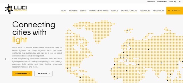
Example – LUCI
LUCI uses large bold lettering and generous white space to highlight its work. The design feels clean and refined while letting the visuals and branding shine effortlessly.
A well-crafted landing page communicates brand identity instantly. PlutoHub does this by presenting a bold, modern landing layout with clear messaging like “Empowering Brands with Digital Excellence”. The design feels confident, uses a strong color palette, and balances bold visuals with concise copy.
Why it mattersA focused landing page helps visitors understand who you are and what you do in seconds. For agencies, this clarity establishes credibility and encourages deeper browsing. A strong landing message gives direction, builds trust, and invites engagement immediately.
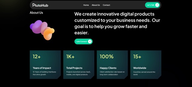
Example – PlutoHub’s “Digital Hub” Design
PlutoHub shares a standout landing page mockup titled Digital Hub – Digital Agency Landing Page on Dribbble. It features impactful typography, a striking color scheme, and bullet-style value statements like Showcase your work effortlessly and Turn visitors into loyal clients. The layout feels both bold and approachable, matching modern agency aesthetics.
A splash page gives a strong visual welcome before deeper content appears. The hero slideshow that follows lets you highlight your best work while keeping the experience dynamic and engaging.
Why it matters
This structure offers impact right away. The splash screen draws people in, then the slideshow hooks them further. It clearly introduces your style and capabilities within seconds of landing.
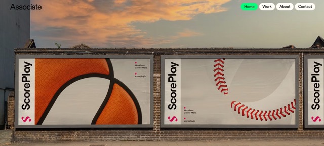
Example – Associate Studio
Associate Studio begins with a bold welcome screen and transitions into a slideshow of top projects. The result is visually exciting and communicates quality fast.
Animated gradients gently shift color or tone over time, and hover feedback responds to user interactions. These subtle motions bring polish and life to a design without overwhelming it.
Why it matters
Micro animations show attention to detail. They make interactive elements obvious and satisfying. Hover feedback and gentle motion help users engage and signal modern craftsmanship.
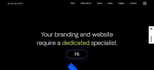
Example – Olya Black
Olya Black combines subtle radial gradients with gentle hover animations on buttons and links. The effect feels refined and lively while staying understated and clean.
Video backgrounds command attention and spark emotion faster than text or static images. A moving scene can showcase your agency's mood or work in seconds. It helps set the tone instantly, builds atmosphere, and gives viewers a reason to stay.
Why it matters
Visitors decide to stay or leave within a few seconds. A well-chosen background video immediately draws them in. It can highlight your work in action or show the creative process, telling a story without words. When done with careful compression, it keeps loading fast while still creating emotional impact.
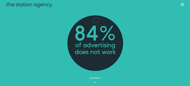
Example: Station
The creative agency's website uses a clever looping video that automatically plays and even reverses. It invites viewers to interact, drawing them into the experience before they scroll. The motion feels engaging, interactive, and memorable.
Using a dark or high-contrast design can give your agency site a bold, stylish edge. It feels modern, sleek, and artistic all at once. High-contrast layouts also help visuals and text pop in a way that minimal color palettes may not.
Why it matters
This design choice stands out and feels confident. It lets your visuals or typography take center stage. Dark themes also reduce eye strain in low-light conditions and can feel elegant when done with balance.
Example: Visual Identity by Anzo Studio
Their site uses a black-and-white layout with crisp processing and subtle scroll effects. The visuals feel striking and refined. Each image and section stands out clearly thanks to this bold palette.
Interactive features that react as you scroll turn passive browsing into active exploration. Text, images, or shapes that slide, fade, or animate into view give each section purpose and delight visitors by inviting them to explore.
Why it matters
Animations guide attention and make content feel alive. They let you highlight important points just when the visitor reaches them. This keeps people reading longer and prevents them from feeling overwhelmed by too much static content at once.
Example: Awwwards Showcase
Many award-winning agency sites use scroll-triggered animations such as elements fading in, shifting, or transforming. This creates a sense of discovery as users move through each section.
Breaking free from rigid structure can add personality and surprise. Mixing a grid layout with freeform elements gives your site structure, but also room for creativity. It supports readability and hierarchy while adding character.
Why it matters
Agency websites should feel creative but still readable. Hybrid layouts offer that balance. Grid systems keep content organized, while freeform touches like offset images or overlapping text create visual interest. This supports design storytelling without confusion.
Example: A Studio with Unique Grid Play
Some creative agency sites featured on design inspiration collections use offset blocks and layered elements within a flexible grid. This lets designers showcase projects in playful arrangements while maintaining structure.
Accessibility is now central to modern web design. An accessibility-first mindset ensures that everyone, including people with disabilities, can use your agency website comfortably. This means paying attention to color contrast, keyboard navigation, alt text for images, and logical heading structures. Agencies that focus on accessibility reach broader audiences and create a reputation for inclusivity.
Why it matters
About 16 percent of the global population lives with some form of disability. Ignoring accessibility cuts off millions of potential visitors and clients. An accessible website is not only a social responsibility but also improves SEO and user satisfaction.
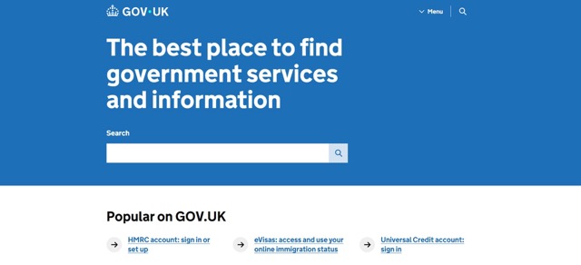
Example: Government Digital Service
The GOV.UK platform emphasizes accessibility by design. Straightforward typography, structured headings, and strong color contrast make the site usable for everyone. Many agencies now follow this example to ensure inclusivity from the ground up.
Dynamic content adapts to user behavior or device context. Instead of displaying the same layout to every visitor, the website adapts to each visitor. This can include customized recommendations, tailored visuals, or location-based content. For an agency, it creates a feeling of exclusivity and care.
Why it matters
Personalization keeps people engaged. Studies show that personalized experiences can increase user engagement by up to 80 percent. In the competitive agency world, this can make a huge difference in retaining visitors and converting them into clients.
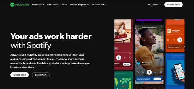
Example: Spotify for Agencies
Spotify's brand site changes its highlighted content based on visitor regions and preferences. Agencies can take inspiration by creating case studies or showcasing services most relevant to the visitor's industry or location.
Micro interactions are tiny animations or responses that happen when a user clicks, hovers, or scrolls. These details might seem small, but they add charm and feedback. They make the interface feel responsive and alive.
Why it matters
Users want to feel confident that their action worked. A button that changes color or an icon that animates when clicked reassures them instantly. These small touches add a layer of polish that separates average websites from memorable ones.
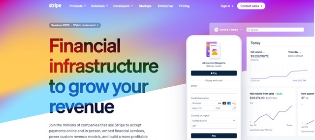
Example: Stripe
Stripe's website integrates smooth micro interactions. Hover over menus or scroll through case studies, and you will notice small but meaningful animations. These add confidence and enjoyment to the experience, which agencies can replicate on their own sites.
Agency websites thrive on proof of work. Instead of listing projects plainly, storytelling can bring case studies to life. Using a combination of visuals, timelines, and client feedback turns static work into a narrative that connects emotionally with visitors.
Why it matters
People remember stories more than facts. Turning case studies into stories builds trust and gives clients a clear picture of how the agency works and what results to expect. This approach strengthens credibility and builds long-term relationships.
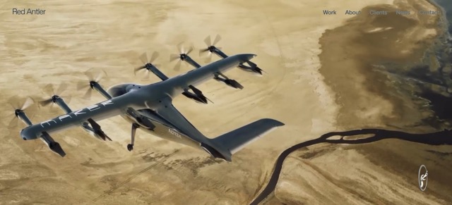
Example: Red Antler
Red Antler's website presents its case studies as brand journeys. Each project includes context, visuals, and outcomes. Visitors not only see the finished product but also understand the thought process behind it, which helps create stronger connections.
A great design loses impact if it loads slowly. Agency websites must be optimized to open quickly, even on slower connections. This means compressing images, minimizing code, and prioritizing critical content first. Performance is a silent design feature that directly affects user experience.
Why it matters
Research shows that a one-second delay in page load time can reduce conversions by up to seven percent. Visitors leave if a site feels heavy or unresponsive. For agencies, fast performance reflects professionalism and technical skill, building trust instantly.
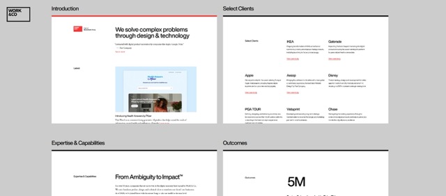
Example: Work and Co
Work and Co developed high-performing sites like Virgin America's early, fully responsive platform. Their focus on speed and usability became a benchmark for modern digital agencies.
An agency site is not just a portfolio; it is also a brand showcase. Strong branding includes consistent use of colors, fonts, icons, and tone of voice. Every page should feel connected and recognizable, giving visitors confidence in the agency's identity.
Why it matters
Brand consistency increases recognition by up to 80 percent, according to marketing studies. Agencies that apply consistent branding show attention to detail and convey reliability. This builds a stronger impression and long-term recognition.
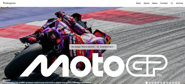
Example: Pentagram
Pentagram's website reflects its global brand with consistent typography and minimal layouts that highlight projects. Every element feels aligned with their design philosophy, reinforcing their identity as a top creative agency.
Navigation is the backbone of usability. For agencies, a mobile-friendly and straightforward navigation system ensures that visitors can easily explore the site. This may include sticky menus, hamburger icons, or bottom navigation bars on phones.
Why it matters
More than 60 percent of web traffic now comes from mobile devices. If navigation is not optimized for smaller screens, users leave quickly. Mobile-first navigation ensures the experience is smooth across all devices, which is vital for keeping attention.
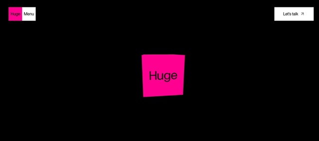
Example: Huge Inc
Huge Inc.'s website uses a simple navigation system that adapts to mobile perfectly. It feels intuitive whether viewed on a phone or desktop, showing the importance of user-centered design choices.
White space, also called negative space, is not space but a design tool. It allows content to breathe, guides the eye, and emphasizes key sections. Agencies often use it to create elegance and balance in their layouts.
Why it matters
Crowded websites feel overwhelming and unprofessional. Effective use of white space improves readability by almost 20 percent and makes content more approachable. It also helps highlight the most critical visuals or calls to action without distraction.
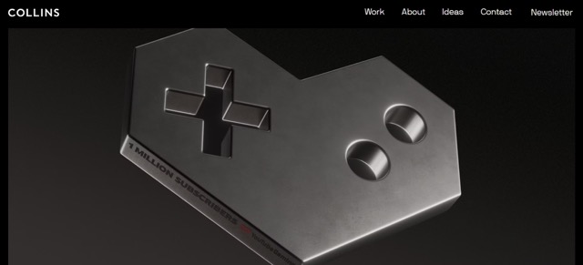
Example: Collins Agency
Collins uses generous white space in its layouts, letting typography and visuals stand out. Their website feels calm and sophisticated, showing how spacing can create impact without clutter.
A footer is often the last thing visitors see, but it can be one of the most valuable sections of an agency website. A well-designed footer guides users toward key pages like services, contact details, or social media links. It can also carry the brand personality through visuals or creative layouts.
Why it matters
Many visitors scroll to the bottom of a page when they want quick contact details or navigation options. A cluttered or incomplete footer creates frustration. A precise footer increases usability, improves conversions, and ensures visitors do not leave without finding what they need. It also reinforces professionalism and trust by offering a consistent finish to the site.
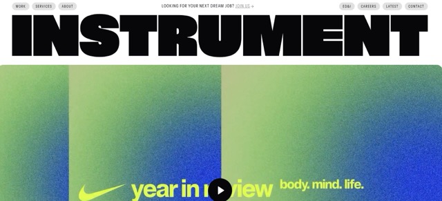
Example: Instrument Agency
Instrument's website uses a structured footer that combines simple navigation, social icons, and a subtle design touch that matches the rest of their branding. It feels clean, functional, and complete, leaving visitors with a positive impression.
Choosing the right design idea for your agency website is not just about style. It is about building a presence that matches your brand, attracts the right clients, and feels timeless and professional.
Every agency has a specific type of client in mind. Before choosing a design direction, it is important to understand who you are designing for. A tech startup founder might appreciate sleek modern layouts with bold visuals, while a traditional business owner may prefer clean, professional, and minimal designs. By aligning your design idea with your audience’s taste and expectations, you create an instant connection. Remember, the design is not for you alone; it is also for the people you want to attract.
Your website is a reflection of your agency’s personality. If your brand is known for creativity and bold campaigns, a vibrant and experimental design makes sense. If you are known for reliability and professionalism, a minimalist, structured design may be a better fit. Consistency builds trust. From color palettes to typography, every element should feel like part of the same story. A website that reflects brand identity helps visitors understand your agency’s values without needing to explain them in words.
No matter how creative your design idea is, it will fail if it is difficult to use. Visitors should be able to navigate smoothly, find information quickly, and enjoy the browsing experience. Simplicity does not mean boring. It means designing with clarity and intention. A design that prioritizes usability keeps people engaged because they are not distracted by confusion. Simple layouts also age better over time, making your site relevant for years instead of just months.
Agencies often want to show creativity, but too much experimental design can frustrate visitors. The key is balance. Use creative touches like animations, unique layouts, or bold visuals, but make sure they do not get in the way of functionality. A good design idea should show off your agency’s creativity while still being practical. Clients should be impressed by your style, but they should also be able to learn about your services and contact you easily.
Design trends change quickly, but your website should not feel outdated within a year. When choosing a design idea, think about longevity. Go for trends that are strong but adaptable, such as minimal layouts, responsive structures, or storytelling formats. Avoid overusing flashy elements that might lose relevance quickly. By thinking long-term, you ensure that your site remains modern and professional while still leaving room for small updates. Longevity is an investment in your agency’s credibility.
An idea may look good on a design board, but the true test is how users interact with it. Before locking in your design, test with real people. Ask colleagues, friends, or potential clients to browse the site and share honest feedback. You might discover that some features feel confusing or that a certain layout works better than expected. Testing saves time and money by catching problems early. A design that performs well with users is always stronger than one that only looks good in theory.
Finally, your chosen design should highlight what your agency does best. If you specialize in branding, make sure your typography and visuals are exceptional. If you focus on digital marketing, your layout should feel modern and data-driven. A website is more than a digital brochure; it is proof of your skills. Visitors should leave the site with the impression that you can do for them what you did for yourself. When the design aligns with your expertise, it becomes a living portfolio that sells your services effortlessly.
A well-designed agency website is more than a collection of pages. It is a living brand experience that communicates values, builds trust, and leaves lasting impressions. The 18 design ideas shared here prove that success comes from blending creativity with usability.
Whether through bold typography, interactive features, or performance-focused structures, every detail matters in shaping how clients connect with your work. By learning from real examples and applying thoughtful design, your agency can create a website that feels fresh, professional, and effective. Design with purpose, and your site will become a true asset for growth.
We Create Unique Digital Experiences For Global Brands By Integrating AI, Innovative Design, And Advanced Technology.


Sakib Al Hasan
Leave a Reply