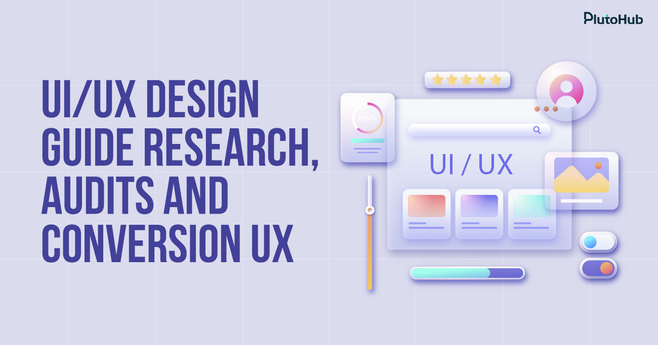
UI/UX design is about making digital products easy to use and pleasant to interact with. It focuses on how users feel when they visit a website, open an app, or complete a task. When the experience is clear and intuitive, people stay longer, trust the brand more, and are more likely to take action.
This guide explains UI and UX design in a simple, practical way. You will learn how user research shapes better design decisions, how UX audits reveal problems that slow users down, and how structure and layout guide people naturally through an experience. Whether you are designing something new or improving what you already have, this guide will help you create digital experiences that feel smooth, thoughtful, and genuinely useful to real users.
UI and UX design describe how digital products look, feel, and work for the people using them. UI design focuses on the visual side of a product, such as layout, colors, typography, and interactive elements. It shapes the first impression and helps users understand what they can do on a screen. UX design focuses on the overall experience, including how easy it is to navigate, find information, and complete tasks without frustration.
Together, UI and UX design aim to make digital experiences clear, efficient, and enjoyable. Good design reduces confusion, supports user goals, and creates a sense of trust. When done well, UI and UX design help users move naturally through a product while feeling confident and in control at every step.
UI and UX play a critical role in how users interact with digital products. Strong design decisions directly influence usability, trust, engagement, and long-term business growth.
UI design is often the first thing users notice when they land on a website or app. Clean layouts, balanced spacing, readable typography, and thoughtful color choices immediately signal professionalism and credibility. Users form opinions within seconds, and a poor visual experience can drive them away before they explore further. A well-crafted interface makes users feel confident that they are in the right place and encourages them to continue interacting with the product.
UX design focuses on how smoothly users can move through a digital experience. Clear navigation, logical content flow, and predictable interactions reduce confusion and frustration. When users can easily find what they need without thinking too hard, they are more likely to complete actions such as signing up, making a purchase, or contacting a business. Good UX removes obstacles and allows users to achieve their goals quickly and comfortably.
Engaging digital experiences keep users coming back. UI elements like buttons, feedback messages, and visual hierarchy guide attention and encourage interaction. UX ensures that each step feels natural and purposeful. When users enjoy using a product and feel that it responds well to their needs, they are more likely to stay longer, return in the future, and develop loyalty toward the brand. Retention often grows from consistent, positive experiences over time.
UI and UX design directly affect conversion rates. Clear calls to action, simple forms, and well-structured pages guide users toward desired outcomes. UX research helps identify where users hesitate or drop off, allowing businesses to refine flows and reduce friction. When design aligns with user intent, it becomes easier for people to take meaningful actions, which leads to better performance across sales, leads, and other key metrics.
A consistent and thoughtful design experience builds trust. Users are more likely to trust brands that feel organized, reliable, and easy to interact with. UX design ensures that expectations are met at every step, while UI design reinforces brand identity visually. Over time, this consistency creates familiarity and confidence, helping businesses stand out in competitive digital spaces and maintain strong relationships with their users.
Understanding users before designing helps avoid assumptions, reduce rework, and create experiences that feel natural. Real insights lead to better decisions, clearer interfaces, and more effective digital products.
Before any design work begins, it is important to understand what users are trying to achieve. Users do not visit a website or app without a reason. Some want quick information, some want to compare options, and others want to complete a task with minimal effort. Identifying these goals helps designers focus on what truly matters. When design decisions support real motivations instead of internal assumptions, the experience feels more relevant and purposeful to users.
User behavior provides valuable clues about how people interact with digital products. This includes how they navigate pages, where they pause, and where they leave. Context is equally important. Users may access a product on mobile, during work hours, or while multitasking. Understanding behavior and context together helps designers create layouts, flows, and interactions that match real-world usage instead of ideal scenarios.
User personas turn research data into relatable profiles that represent key audience segments. These personas highlight user needs, pain points, habits, and expectations. They help teams stay aligned by keeping real users at the center of discussions. Instead of designing for everyone, personas encourage focused decisions that serve specific user groups. This clarity leads to more consistent and user-friendly design outcomes.
User journey mapping visualizes the steps users take from first contact to final action. It highlights touchpoints, emotions, and potential friction along the way. This process helps identify moments where users may feel confused, frustrated, or unsure. By understanding the full journey, designers can improve transitions, simplify steps, and remove unnecessary obstacles. A well-mapped journey leads to smoother and more satisfying experiences.
Even well-researched ideas need validation. User feedback helps confirm whether design assumptions are accurate. This can come from interviews, surveys, usability tests, or simple observations. Feedback reveals gaps between what designers expect and what users actually experience. Addressing these gaps early reduces costly revisions later and ensures the final design aligns closely with user needs and expectations.
When to Conduct a UX Audit
A UX audit helps identify usability issues that affect performance and user satisfaction. Knowing the right time to conduct an audit ensures problems are addressed before they impact conversions, trust, or growth.
A noticeable decline in engagement is often one of the clearest signals that a UX audit is needed. If users are spending less time on pages, interacting less with features, or leaving sooner than expected, the experience may no longer meet their needs. These changes usually point to hidden friction such as confusing navigation, unclear messaging, or poor visual hierarchy. A UX audit helps uncover where users are getting stuck and why their interest is fading.
Low conversion rates often indicate problems within the user journey. Users may understand the offer but struggle with forms, checkout steps, or calls to action. A UX audit examines these critical paths in detail, identifying unnecessary steps, unclear instructions, or design elements that create hesitation. By reviewing user flows and interaction patterns, businesses can pinpoint exactly where potential customers drop off and what prevents them from taking action.
As products evolve, new features, content, and pages are added, often without a unified experience strategy. Over time, this growth can lead to inconsistency, clutter, and confusing structures. A UX audit helps realign the experience by reviewing navigation, layout, and information structure. It ensures that the product still feels cohesive and easy to use, even after multiple updates or expansions.
Before launching a redesign or scaling a platform, a UX audit provides a clear baseline of what is working and what is not. It helps teams avoid repeating existing mistakes and protects elements that already perform well. An audit also highlights user expectations and behaviors that should guide future design decisions. This makes redesign efforts more focused, efficient, and aligned with real user needs.
Clear structure makes digital experiences easier to understand and easier to use. When information architecture is done right, users move naturally through content without confusion. Everything feels intentional, familiar, and simple to navigate.
The foundation of good information architecture is user intent. Users do not think in terms of departments, services, or internal processes. They think in terms of goals and problems they want to solve. Structuring content around real user needs helps remove friction and makes the experience feel intuitive. When you design for intent first, users reach the right information faster and with less effort.
Content should be grouped based on how users mentally connect information. Related topics belong together, while unrelated ones should stay clearly separate. Logical grouping reduces cognitive load and helps users understand where they are within the experience. When content is organized in a way that makes sense, users feel more confident and less overwhelmed while navigating.
Navigation plays a critical role in information architecture. Menus, links, and page structures should feel familiar and easy to understand. Labels must be clear and descriptive so users know what to expect before clicking. Predictable navigation builds trust and allows users to move through content without second guessing their actions.
Hierarchy helps users scan and process information quickly. Headings, spacing, and layout guide attention and show what is most important. A strong hierarchy makes it easy to distinguish primary content from supporting details. When users can visually understand structure at a glance, they are more likely to stay engaged and absorb information.
Information architecture improves over time through observation and testing. Watching how users navigate, where they hesitate, and where they get lost reveals gaps in structure. These insights help refine labels, grouping, and flow. Continuous refinement ensures the experience stays clear, usable, and aligned with real user behavior.
Visual design shapes how users understand and interact with an interface. When done intentionally, it guides attention, supports usability, and creates experiences that feel clear and trustworthy from the first interaction.
A clean layout helps users understand content without effort. Proper spacing between elements creates breathing room and prevents visual overload. When layouts are well balanced, users can quickly scan pages, recognize sections, and focus on what matters most. Clear alignment and spacing also reduce confusion, making interactions feel smoother and more predictable.
Color and typography work together to create structure and meaning. Consistent color usage helps users identify actions, highlights important elements, and reinforces brand identity. Typography improves readability and sets the tone of the experience. When fonts, sizes, and styles are used consistently, interfaces feel polished and easier to navigate, allowing users to process information without distraction.
Visual hierarchy directs users toward the most important elements first. Size, contrast, and placement help establish priority and guide the eye naturally through the interface. Clear hierarchy ensures users know where to start and what to do next. When focus is intentional, users feel more confident and less overwhelmed during interactions.
Visual feedback reassures users that their actions are recognized. Subtle changes such as button states, loading indicators, or confirmation messages improve usability and trust. Responsive visual cues help users understand system behavior and reduce uncertainty. When feedback feels natural and timely, interactions become more engaging and intuitive.
Strong UX decisions are grounded in research, not assumptions. Research helps designers understand real user needs, validate ideas, and reduce risk by guiding design choices with evidence instead of guesswork.
User interviews provide deep insight into how people think, feel, and behave. Speaking directly with users helps uncover motivations, frustrations, and expectations that are not always visible through analytics. These conversations reveal the reasons behind user actions and highlight problems users may struggle to explain on their own. Well-planned interviews help designers ask better questions and build empathy that informs more thoughtful design decisions.
Analytics show what users do rather than what they say. Data such as page views, click paths, session duration, and drop-off points reveal patterns in behavior. This information helps identify where users struggle or disengage. When combined with qualitative insights, analytics provide a clear picture of how design choices impact real usage and where improvements are needed.
Usability testing allows designers to observe users interacting with a product in real time. Watching users complete tasks highlights friction points, confusion, and unmet expectations. Small issues often become obvious during testing, even when they seem minor on paper. Regular testing ensures designs remain easy to use and aligned with user needs before and after launch.
Surveys help collect insights from a larger audience quickly. They are useful for validating assumptions, measuring satisfaction, and identifying common pain points. Feedback tools such as in-app prompts or follow-up questions provide ongoing insight into user experience. When feedback is reviewed consistently, it helps teams prioritize improvements that matter most to users.
A UX competitive analysis helps designers understand how similar products solve user problems and where opportunities exist. Evaluating the right areas reveals strengths, gaps, and ideas that can inform smarter design decisions.
One of the first things to evaluate is how easily users can complete key tasks. This includes onboarding, navigation, and common actions such as signing up or making a purchase. Comparing user flows across competitors shows where experiences feel smoother or more complicated. Identifying unnecessary steps or unclear transitions helps highlight areas where your product can offer a simpler and more efficient experience.
Visual clarity plays a major role in usability. Evaluating layout structure, typography, spacing, and color usage reveals how well competitors communicate information. Consistency across pages and features also matters. Inconsistent visuals often lead to confusion, while clear and unified interfaces feel more trustworthy. This evaluation helps identify visual patterns that support or hinder user understanding.
How content is organized has a direct impact on user experience. Reviewing menus, navigation systems, and page hierarchies shows how competitors structure information. Pay attention to labeling, grouping, and the ease of finding key content. Strong information architecture reduces effort and guides users naturally, while poor structure creates friction and frustration.
Accessibility and support features are often overlooked but are critical to inclusive design. Evaluating text readability, contrast, keyboard navigation, and error handling reveals how well competitors support different user needs. User support elements such as help content, onboarding guidance, and feedback messages also play an important role. These insights help identify opportunities to create a more inclusive and supportive experience.
UI design shapes how users feel about a product long before they consciously evaluate it. Every visual choice sends a signal that affects trust, comfort, and expectations throughout the entire experience.
Users form opinions within seconds of seeing an interface. Clean layouts, balanced spacing, and thoughtful typography immediately communicate professionalism and reliability. When an interface looks cluttered or outdated, users may question the credibility of the product before interacting further. Strong visual design creates a sense of trust and reassures users that the experience is worth their time.
Color and visual style influence emotions more than most users realize. Warm tones can feel welcoming, while cooler tones often signal stability and calm. Consistent visual style helps users feel oriented and comfortable as they move through an interface. When design choices align with the brand personality, users develop an emotional connection that goes beyond functionality.
UI design plays a major role in how easy a product feels to use. Clear labels, recognizable icons, and consistent patterns reduce mental effort. Even complex systems can feel simple when the interface guides users clearly. When users feel that a product is easy to understand, they are more confident and more willing to explore.
Visual hierarchy directs users toward what matters most. Size, contrast, and placement guide the eye and shape user behavior. Well-designed interfaces help users focus on key actions without distraction. Poor hierarchy can overwhelm users or hide important elements, leading to confusion and missed opportunities.
UI design reinforces brand identity at every interaction. Consistent use of color, typography, and layout creates familiarity and recognition over time. When users repeatedly experience a polished and reliable interface, trust grows naturally. This consistency strengthens brand perception and encourages long-term engagement.
User experience is not something that gets added after a product is built. It plays a core role in product strategy from the very beginning. When UX is part of strategic thinking, products are shaped around real user needs instead of assumptions, trends, or internal opinions.
UX helps translate user needs into business value. Through research and observation, UX uncovers what users are trying to achieve, what frustrates them, and what motivates their decisions. Product strategy uses these insights to define solutions that serve users while supporting business goals such as growth, retention, or efficiency. When UX and strategy are aligned, products feel purposeful instead of forced.
UX has the strongest impact when it is involved early in the product lifecycle. Early research helps teams decide what to build, not just how it should look. This prevents wasted effort on features that users do not need or understand. UX insights guide product direction by identifying real problems worth solving and shaping the overall experience before development begins.
Product teams often face long lists of feature requests and limited resources. UX research helps cut through the noise by showing which features matter most to users. Instead of prioritizing based on internal pressure or assumptions, teams can focus on changes that improve usability and satisfaction. This leads to clearer roadmaps and better use of time and budget.
Every product decision carries risk. UX reduces that risk through testing and validation. Prototypes, usability testing, and user feedback allow teams to evaluate ideas before investing heavily in development. This process highlights issues early, when changes are easier and less costly. Validated decisions lead to stronger launches and fewer surprises after release.
UX creates a shared understanding across product, design, development, and marketing teams. User insights provide a common reference point for decision-making. When teams understand user behavior and expectations, collaboration improves and debates become more constructive. UX helps keep everyone focused on solving the right problems instead of defending individual opinions.
UX is not limited to initial launches. Ongoing research and iteration help products evolve as user needs change. UX insights guide improvements, refinements, and new opportunities over time. This long-term perspective supports sustainable growth and keeps products relevant in competitive markets. When UX is embedded in product strategy, it becomes a continuous driver of improvement rather than a one-time effort.
Poor design choices often seem small at first, but over time they damage usability, trust, and results. Avoiding common UI and UX mistakes helps create smoother, clearer, and more reliable digital experiences.
One of the most damaging mistakes in UI and UX design is prioritizing internal opinions over real user needs. Stakeholders often have strong preferences based on personal taste, assumptions, or past experiences. While their input is valuable, it should never outweigh actual user behavior and research. When design decisions are driven by opinion instead of evidence, products often miss the mark.
Users approach digital products with specific goals. They want clarity, speed, and ease. Designs shaped by internal bias can introduce unnecessary features, confusing layouts, or overly complex flows. Over time, this disconnect leads to frustration and disengagement. Successful experiences are built by listening to users, validating ideas through research, and letting real behavior guide decisions.
Trying to communicate everything at once is a common design trap. Overloaded screens filled with text, visuals, buttons, and options create cognitive overload. When users are presented with too many choices, decision-making becomes harder and confidence drops. Instead of feeling guided, users feel overwhelmed.
Good design relies on prioritization. Every element should earn its place by supporting a clear user goal. Removing unnecessary content improves focus and helps users move forward without hesitation. Simpler interfaces are not empty, they are intentional. By reducing clutter and highlighting what matters most, designers make experiences easier to understand and more enjoyable to use.
Navigation issues are a major source of frustration for users. Confusing menus, unclear labels, and inconsistent page structures force users to work harder than they should. When users cannot predict where links lead or struggle to find basic information, trust erodes quickly.
Strong navigation should feel almost invisible. Users should always know where they are, where they can go next, and how to get back. Weak information structure often comes from organizing content around business logic instead of user logic. Clear labels, logical grouping, and consistent patterns help users move confidently through an experience. When navigation fails, even good content loses its value.
Accessibility is still treated as an afterthought in many digital products, but ignoring it harms both users and businesses. Low contrast text, small font sizes, unclear focus states, and poor keyboard support make experiences difficult or impossible for many people. Accessibility is not only about compliance, it is about usability for everyone.
Inclusive design improves clarity, readability, and interaction for all users, including those in challenging environments or on smaller devices. When accessibility is ignored, products feel less thoughtful and less reliable. Addressing accessibility early leads to cleaner design, clearer interactions, and broader reach without compromising visual quality.
Assuming a design works without testing is one of the most costly mistakes teams make. Designers are deeply familiar with their own work, which makes it difficult to spot confusion or friction. What feels obvious internally may not be clear to users at all.
Usability testing reveals issues that planning alone cannot predict. Watching users struggle with simple tasks exposes gaps in clarity, flow, and structure. Skipping testing often leads to late-stage fixes, repeated redesigns, and lost opportunities. Validation does not slow teams down, it saves time and resources. Regular testing ensures designs remain aligned with real user behavior and expectations.
Businesses choose Plutohub for UI UX design because the focus goes beyond visuals and trends. Every design decision starts with understanding users, business goals, and real performance data. Plutohub takes a strategic approach, combining UX research, thoughtful interface design, and clear information structure to create experiences that feel simple and effective.
Instead of one size fits all solutions, Plutohub designs with intent. Each project is shaped around usability, conversion, and long-term growth. The team works closely with clients, developers, and marketing teams to ensure design supports the full digital journey. This collaborative, research-driven approach helps businesses build products and platforms that users trust, enjoy using, and return to consistently.
UI/UX design is not limited to how a product looks. Visual design is just one part of the process. UX focuses on usability, structure, flow, and how easily users can achieve their goals. A visually attractive interface can still fail if it is confusing or difficult to use. Strong UI/UX design balances aesthetics with clarity, functionality, and user needs.
Some businesses may see short-term success without UX research, but long-term growth becomes difficult. Without research, decisions are based on assumptions rather than real user behavior. UX research helps identify pain points, expectations, and opportunities for improvement. Investing in research reduces risk and leads to more effective, user-friendly products.
Good UI does not guarantee good UX. An interface can look clean and modern while still being hard to navigate or inefficient. UX design ensures that interactions feel logical, tasks are easy to complete, and the experience flows smoothly. UI supports UX, but it cannot replace thoughtful experience design.
UI/UX design is an ongoing process. User needs, behaviors, and technologies change over time. Regular testing, feedback, and iteration help keep experiences relevant and effective. Treating UI/UX as a continuous effort leads to better long-term results than a one-time design approach.
UI/UX design can improve usability and clarity, but it cannot fix a product that does not solve a real problem. Design can help present an idea more clearly, but strong UX works best when the underlying concept meets genuine user needs. Research helps validate ideas early and reduce this risk.
Features are important, but how users experience those features matters more. A product with fewer features but a clear and intuitive experience often performs better than a complex product that is hard to use. UI/UX design helps users understand and benefit from features without feeling overwhelmed.


Sakib Al Hasan
Leave a Reply