A triadic color scheme uses three colors that are evenly spaced on the color wheel. When used correctly, it creates designs that feel balanced, vibrant, and visually engaging without becoming overwhelming. Many designers choose triadic schemes to add energy while still maintaining harmony.
Using a triadic color scheme is not just about picking three bold colors. It requires a careful balance between a dominant color, supporting tones, and subtle accents. Without structure, the result can feel noisy or unprofessional. When applied thoughtfully, triadic palettes work well in branding, UI design, and marketing visuals.
This guide explains how to use a triadic color scheme step by step, common mistakes to avoid, and practical tips to help your designs feel confident, clear, and visually consistent.
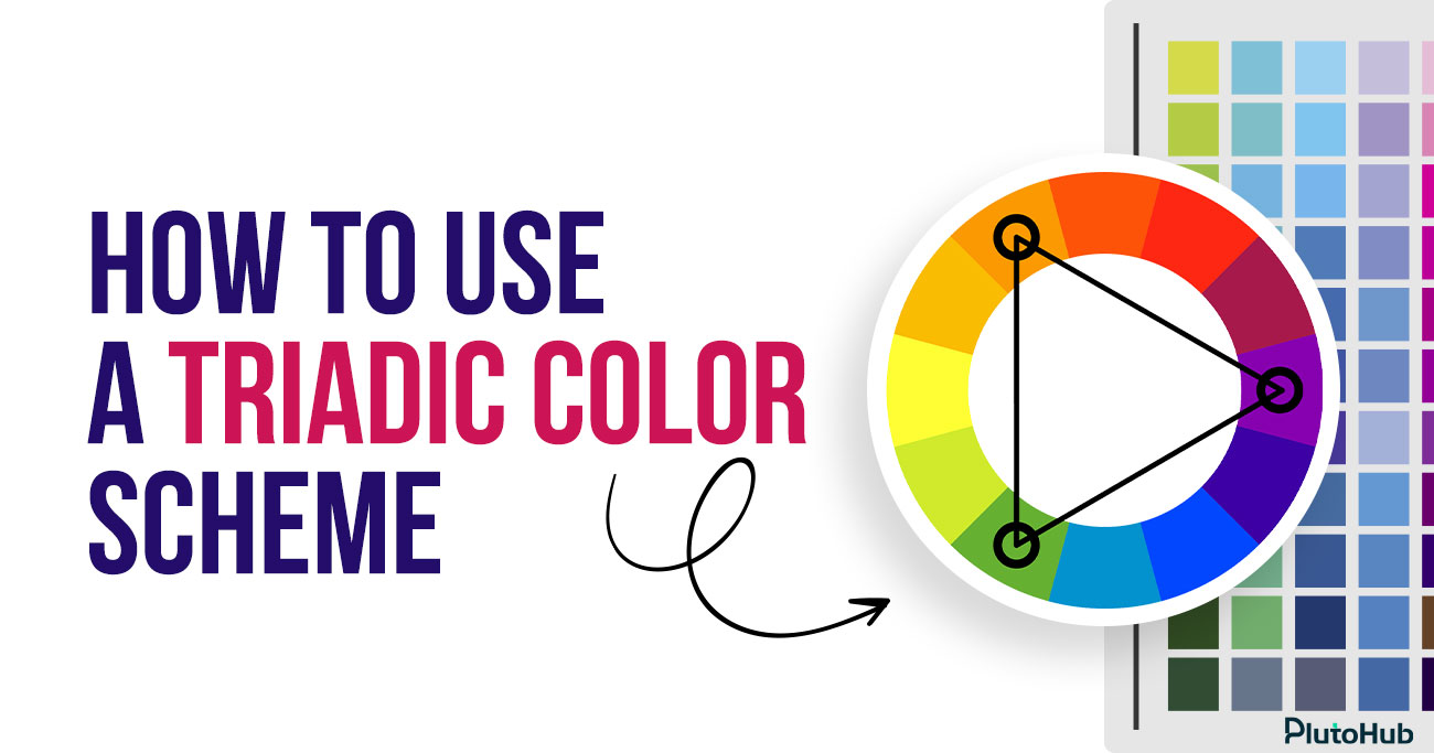
A triadic color scheme is a color system that uses three colors placed evenly apart on the color wheel. These colors form a triangle, creating a balanced and dynamic relationship. Because the colors are equally spaced, the scheme offers strong contrast while still maintaining visual harmony.
Designers often use triadic color schemes to create lively and engaging designs without relying on too many shades. One color usually takes the lead, while the other two support it as accents. When used correctly, a triadic color scheme adds energy, clarity, and structure to visual designs across branding, UI, and marketing.
Image Description: Blog section explaining why designers use triadic color schemes, focusing on balanced contrast, visual clarity, hierarchy, usability, and controlled visual energy in UI and UX design
Alt Text: Triadic color schemes in UI UX
Triadic color schemes are popular in UI and UX design because they balance contrast, clarity, and visual energy. When applied with intention, they help designers solve real interface problems, not just create attractive screens.
Triadic color schemes provide strong contrast while still feeling organized. Because the three colors are evenly spaced on the color wheel, they naturally balance each other. In UI design, this allows designers to separate sections, actions, and states clearly without relying on too many shades. The interface feels energetic but controlled, which is critical for usability. Users can distinguish elements quickly without feeling overwhelmed by clashing colors.
In UX design, hierarchy is everything. Triadic schemes make it easier to assign roles to colors. One color becomes dominant, another supports secondary elements, and the third highlights key actions such as primary buttons or alerts. This structure helps users understand what matters most at a glance. When color roles are consistent, users learn faster and interact with confidence.
Triadic color schemes help products stand out. Many interfaces look similar because they rely on safe, neutral palettes. A well-chosen triadic scheme creates a distinctive visual identity without sacrificing usability. For brands, this means better recognition and recall. For products, it creates a consistent look across screens, features, and platforms, which builds trust over time.
One of the biggest advantages of triadic schemes is flexibility. Designers can use the same three colors across buttons, cards, navigation, icons, and states without running out of usable combinations. This makes it easier to scale a design system. Instead of constantly introducing new colors, teams reuse the same palette in different roles, keeping the interface cohesive and easier to maintain.
UI elements need clear states such as hover, active, disabled, success, or error. Triadic color schemes provide enough variation to design these states without confusion. One color can represent default actions, another can signal interaction or focus, and the third can handle feedback or alerts. This clarity improves interaction design and reduces user errors.
Designers often struggle to balance creativity with usability. Triadic color schemes sit comfortably in the middle. They allow expressive, modern designs while still following predictable rules. This makes them especially useful in SaaS dashboards, fintech interfaces, and product marketing pages where clarity and personality must coexist. When applied thoughtfully, triadic schemes enhance usability instead of distracting from it.
Image Description: Blog section explaining how the triadic color scheme works on the color wheel, focusing on equal spacing, geometric balance, contrast control, hierarchy, and structured color usage
Alt Text: Triadic color scheme color wheel
A triadic color scheme is built on balance rather than similarity. It works by choosing three colors that sit at equal distances from each other on the color wheel. This equal spacing creates a strong relationship between the colors, allowing them to contrast without clashing. The result is a palette that feels energetic, structured, and visually stable.
The color wheel is circular, so every color has a clear position. When one color is selected, the other two are found by moving the same distance around the wheel in both directions. These three points form a triangle. Because the spacing is equal, none of the colors feels random or disconnected from the others.
Triadic schemes do not rely on similar tones to feel harmonious. Instead, balance comes from the geometric relationship between the colors. Each hue carries equal visual importance on the wheel. This allows designers to work with contrast while maintaining cohesion, especially in bold or expressive designs.
No color automatically dominates in a triadic scheme. Visual hierarchy is created through how often each color appears and where it is placed. One color usually covers large areas, another supports secondary elements, and the third highlights key actions. This control keeps the design readable and intentional.
Hue alone does not define how a triadic scheme feels. Adjusting saturation and brightness helps control intensity. Designers often soften one or two colors to reduce visual strain, reserving stronger tones for emphasis. This makes the scheme easier to apply across full interfaces.
Once the three colors and their roles are defined, consistency does the rest. Using the same relationships across screens, components, and states reinforces clarity and strengthens visual identity without adding complexity.
Choosing the right three colors for a triadic color scheme is less about personal taste and more about balance, purpose, and context. The goal is to create contrast that feels intentional and usable, not overwhelming.
Before picking any colors, be clear about what the design needs to achieve. A marketing page, a SaaS dashboard, and a fintech app all have different requirements. Decide whether the design should feel energetic, calm, playful, or professional. This purpose helps narrow down which area of the color wheel makes sense to start from.
A strong triadic scheme begins with a single anchor color. This is usually a brand color or the tone that best represents the product. Choosing this color first gives the palette direction. Once the anchor is selected, the other two colors are derived from it using the color wheel, rather than chosen randomly.
With the anchor color chosen, locate the other two colors by spacing them evenly around the color wheel. The equal distance is what creates harmony. Avoid adjusting hue positions too much, as this breaks the triadic relationship. At this stage, focus only on hue, not brightness or saturation.
Pure triadic colors can feel intense. To make the scheme usable, adjust saturation and brightness rather than changing hue. One color can stay bold, while the others are softened. This keeps contrast while reducing visual noise, especially in interfaces with a lot of content.
The three colors should not compete equally. Assign roles early. One color should dominate, one should support, and one should act as an accent. This makes the palette practical for real layouts and helps users understand hierarchy without confusion.
Colors behave differently in isolation than they do in real designs. Apply the three colors to actual screens, components, and states. Check readability, contrast, and emotional tone. If the design feels tiring or unclear, refine saturation and usage before changing hues.
Balancing dominant and accent colors is what makes a triadic color scheme feel polished instead of chaotic. Without clear roles, even well-chosen colors can compete for attention and reduce usability.
Every triadic color scheme needs a clear leader. The dominant color should cover most of the interface and set the overall tone. This is usually a brand color or a neutral-friendly hue that works well in large areas like backgrounds, main sections, or containers. Using one color consistently as the base helps ground the design and prevents visual overload.
The second color in a triadic scheme should support the dominant one, not challenge it. This color works well for secondary UI elements such as cards, navigation highlights, icons, or section dividers. It adds variety without pulling focus away from primary content. Keeping this color slightly softer in saturation helps maintain balance.
The third color should act as an accent. Its role is to attract attention, not to decorate. Use it sparingly for primary buttons, important links, alerts, or key highlights. When the accent color appears less often, it becomes more meaningful. Users quickly learn that this color signals action or importance.
Balance is not only about where colors are used, but also how intense they feel. Lowering saturation for large surfaces and reserving brighter tones for small elements keeps the interface comfortable. Adequate spacing around accent-colored elements also increases their impact without increasing visual noise.
Once color roles are defined, consistency is critical. Using the same color for the same purpose across screens reinforces hierarchy and improves usability. A predictable color system helps users navigate faster and builds trust in the design.
Triadic color schemes can bring energy and clarity to UI and web design when applied with structure. The key is not using all three colors everywhere, but assigning clear roles so the interface stays usable and visually balanced.
In UI and web design, hierarchy should guide color usage. One color should dominate large areas such as backgrounds, main sections, or containers. This creates visual stability. The second color works well for secondary elements like cards, navigation highlights, icons, or tabs. The third color should be reserved for high-priority actions. When colors follow hierarchy, users understand where to focus without effort.
Triadic schemes are especially effective for guiding interaction. Accent colors can highlight primary buttons, key links, or important states like success or warnings. Because the accent color contrasts strongly with the dominant tone, calls to action become immediately visible. This improves click-through rates and reduces hesitation, especially on landing pages and product flows.
Bright triadic palettes can quickly reduce readability if not controlled. In web and UI design, backgrounds should remain calm and predictable. Use neutral versions of the dominant color or softer tints for large surfaces. Text should never compete with accent colors. High contrast between text and background is essential to maintain accessibility and comfort.
Triadic color schemes work best when applied consistently. Buttons, links, alerts, and highlights should always use the same color roles across pages. This consistency helps users learn the interface faster and builds trust. Changing color meaning from screen to screen creates confusion and weakens usability.
Colors behave differently in real interfaces than in palettes. Always test triadic colors in actual layouts, including mobile views. Check how colors interact across sections, states, and screen sizes. Refining usage early prevents visual fatigue and ensures the design feels confident, clear, and professional.
Triadic color schemes can create vibrant, balanced designs, but they are also easy to misuse. Many designs fail not because the colors are wrong, but because they are applied without clear rules or intent. Below are the most common mistakes designers make when working with triadic colors and why they hurt usability and visual clarity.
One of the biggest mistakes is treating all three colors as equally important. When every color competes for attention, the design loses hierarchy. Users cannot tell what to focus on first, which action matters most, or which elements are secondary. The interface starts to feel noisy and stressful instead of energetic.
Triadic schemes work only when one color clearly dominates, another supports, and the third acts as an accent. Without this structure, even a well-chosen palette feels unprofessional and hard to use.
Another common error is applying all three colors to large sections of the layout. Big color blocks demand attention, and using three strong colors at that scale quickly overwhelms the eye. Instead of feeling balanced, the design feels heavy and crowded.
Large surfaces should almost always belong to the dominant color. Supporting and accent colors work best in smaller areas such as buttons, icons, highlights, or section markers. This restraint keeps the design readable and visually calm.
Designers sometimes focus so much on color harmony that they forget basic readability rules. Triadic palettes often include bright hues, which can reduce contrast between text and background if not handled carefully. Poor contrast makes text hard to read and can cause eye strain.
Readability should always come first. Text must remain clear in all contexts, including long paragraphs, forms, and mobile views. If color choices interfere with legibility, the palette needs adjustment, usually through brightness or saturation changes.
Accent colors are meant to attract attention, but many designers use them too frequently. When accent colors appear everywhere, they lose their meaning. Buttons, links, badges, and highlights all start to compete, and users stop noticing what is truly important.
A good rule is to use the accent color only where action or emphasis is required. Less usage increases impact and helps users understand where to click or focus.
Triadic color schemes often look great in palettes or mockups, but real interfaces are more complex. Designers sometimes skip testing colors in full layouts, across different screens and states. As a result, colors that seemed balanced initially feel harsh or distracting in practice.
Applying colors to real components, content, and interactions reveals issues early. Testing helps refine usage before problems reach users.
Inconsistent color roles confuse users. When a color represents a primary action on one screen and a background element on another, users lose trust in the interface. Triadic schemes rely heavily on consistency.
Each color should keep the same role throughout the product. Consistent usage improves usability, speeds up learning, and creates a stronger visual identity.
Triadic color schemes can look vibrant and confident, but without control they can easily feel loud or unpolished. The difference between a playful palette and a professional one comes down to how intentionally the colors are used. The following best practices help keep triadic schemes balanced, usable, and visually refined.
A professional triadic scheme always has structure. One color should clearly dominate the design, another should support secondary elements, and the third should be reserved for accents. When these roles are defined early, color usage becomes predictable and easy to maintain. This prevents visual competition and helps users understand hierarchy naturally. Clear roles also make the palette scalable across screens and components.
Pure triadic colors can be overwhelming when used at full strength. Adjusting saturation and brightness allows designers to soften large areas while keeping contrast where it matters. Dominant colors often work best in muted or neutral tones, while accents can stay more vibrant. This balance keeps the interface comfortable to look at for longer periods and avoids visual fatigue.
Professional designs rarely rely only on color. Neutral space is essential in triadic schemes to give bold colors room to breathe. Whites, grays, or soft neutrals help anchor the palette and reduce noise. This contrast between neutral areas and colorful elements makes the design feel more intentional and easier to scan.
Consistency is critical for professionalism. Buttons, links, alerts, and highlights should always use the same color roles across the interface. When users learn what each color represents, interaction becomes faster and more intuitive. Inconsistent usage breaks trust and makes the design feel unfinished. A documented color system helps teams maintain this consistency over time.
Professional design must be usable by everyone. Triadic schemes should always be tested for contrast, readability, and accessibility. Colors that look good visually may fail accessibility standards or cause eye strain. Testing across devices, lighting conditions, and interaction states ensures the palette works in real situations, not just in design tools.
Color should support structure, not replace it. Strong layout, spacing, and typography reduce the need to rely on color for clarity. When hierarchy is clear through size and placement, colors can be used more sparingly and effectively. This restraint is what separates professional triadic designs from purely decorative ones.
Triadic color schemes are widely used in real products because they balance energy, clarity, and flexibility. When applied with intention, they help brands stand out while keeping interfaces usable and structured. Below are practical, real-world style examples of how triadic color schemes work across different design contexts.
Google is one of the clearest real-world examples of a triadic color scheme done right. Blue, red, and yellow sit evenly apart on the color wheel, forming a classic triad. Google uses blue as the dominant color across interfaces, red for alerts and emphasis, and yellow for highlights and accents. The colors are never equal in weight. Blue anchors trust and usability, while red and yellow inject energy in controlled moments. This balance keeps Google’s products familiar, playful, and highly usable at massive scale.
Microsoft’s ecosystem often reflects a triadic relationship built around blue, green, and orange. Blue dominates as the primary brand and UI color, green supports success states and confirmations, and orange highlights important actions or notifications. The triadic relationship adds contrast without aggression, which is important for enterprise and productivity tools. The palette feels professional while still dynamic.
Slack uses a refined triadic palette where purple acts as the dominant brand color, green supports success and presence states, and yellow highlights attention-driven elements like notifications. These three colors are spaced evenly on the color wheel, creating strong contrast without visual noise. Slack softens saturation to keep long-term usability comfortable while still maintaining a distinctive brand identity.
Figma’s interface and branding lean heavily into a triadic structure. Purple serves as the foundation, red draws attention to collaboration and alerts, and green signals success and completion. The triadic relationship supports fast visual scanning in collaborative workflows. Importantly, Figma uses neutral grays to balance the triad, proving that professional triadic schemes rely on restraint, not constant color use.
LEGO’s branding is a textbook triadic example. Red is dominant, yellow adds warmth and visibility, and blue balances the palette with trust and calm. These colors are evenly spaced on the color wheel and used consistently across packaging, digital products, and marketing. The result feels energetic, playful, and instantly recognizable without becoming chaotic.
PlutoHub uses triadic color schemes to create interfaces that are visually distinctive without sacrificing usability. By assigning clear roles to each color, we help products communicate hierarchy, guide user actions, and strengthen brand recognition at the same time. One color anchors the experience and builds familiarity, another supports structure and content flow, while the accent color draws attention to key interactions.
This approach allows brands to stand out in competitive markets without overwhelming users. Triadic color systems also make design more scalable. As products grow, the same color logic can be applied across new features, screens, and platforms. The result is a consistent visual identity, clearer user journeys, and interfaces that feel confident, usable, and memorable from the first interaction.
Triadic color schemes create strong contrast while maintaining balance. When used with clear roles, they help guide attention, improve hierarchy, and make interfaces feel energetic without becoming overwhelming.
We choose the dominant color based on brand identity and usability needs. It is usually the color that can comfortably cover large areas while keeping content readable and calm.
Yes. When saturation and usage are controlled, triadic schemes work well for SaaS, fintech, and B2B products. The key is restraint and clear color hierarchy.
Using three consistent, well-defined colors across screens builds familiarity. Over time, users associate those colors with the brand, improving recall and trust.
They can be very accessible when contrast is tested properly. We always ensure text readability, clear focus states, and compliant color contrast across all interactions.
Triadic schemes scale well because colors already have defined roles. New features and components can reuse the same logic without introducing new colors.
Neither is better by default. Triadic schemes offer more flexibility and energy, while complementary schemes feel simpler. The right choice depends on product goals and brand personality.


Sakib Al Hasan
Leave a Reply