 Sakib Al Hasan
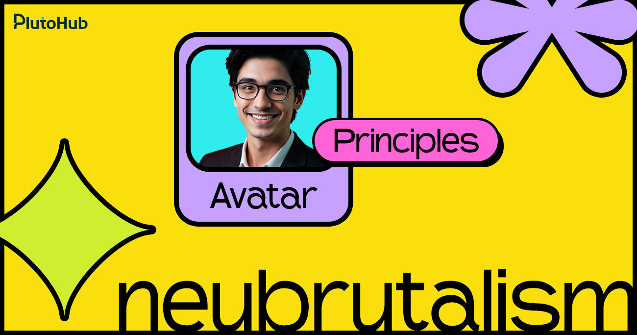
Neobrutalism UI design is bold, expressive, and intentionally different from polished, minimal interfaces. It takes inspiration from classic brutalism and adapts it for modern digital products. The result is a visual style that feels raw, confident, and hard to ignore.
In recent years, neobrutalism has gained popularity in websites, landing pages, and creative products that want to stand out fast. Bright colors, strong contrast, thick borders, and oversized typography are common elements. But good neobrutalism is not about being messy. It still follows structure, hierarchy, and usability rules.
This guide explains what neobrutalism really means in UI design, when it works best, and the practical rules to follow so your design looks bold without sacrificing clarity or user experience.
Neobrutalism in modern UI is a design style that focuses on bold visuals and clear intent. It uses strong colors, high contrast, thick borders, and oversized typography to create interfaces that feel direct and expressive. Instead of hiding elements behind subtle effects, neobrutalism makes structure and interaction obvious.
This style evolved from classic brutalism but is more refined and usable. While it looks raw on the surface, good neobrutalism still follows layout rules, spacing, and hierarchy. Designers use it to grab attention, create a strong brand identity, and communicate quickly. In modern UI, neobrutalism works best when clarity comes first. The goal is not chaos, but confidence.
Neobrutalism is not random or careless design. It follows clear visual principles that prioritize boldness, clarity, and intent, while still respecting usability and structure in modern user interfaces.
Color is one of the strongest signals in neobrutalism. Bright, saturated colors are used with confidence to grab attention instantly. Instead of subtle gradients or muted tones, neobrutalism favors solid color blocks that feel energetic and direct. These colors are not decorative. They are functional. Primary actions often use the loudest colors, while secondary elements stay calmer. When done well, color helps users understand what matters most within seconds.
Neobrutalist interfaces rely heavily on contrast to create instant clarity. Light and dark elements are placed next to each other without soft transitions. Text stands out sharply from backgrounds. Buttons look unmistakably clickable. This high contrast approach removes ambiguity and makes scanning faster. Users do not need to guess where to look or what to do next because hierarchy is visually obvious.
Borders are not hidden in neobrutalism. They are thick, visible, and intentional. Cards, buttons, inputs, and containers are clearly separated using strong outlines. This helps define structure and prevents content from blending together. The result feels sturdy and grounded. These borders also add a tactile quality, making digital elements feel more physical and real.
Typography in neobrutalism is bold and expressive. Headlines are often large and commanding, sometimes taking up more space than expected. This is not for decoration. Large type helps communicate messages quickly and creates a clear reading order. Body text stays readable and simple, while headings do the heavy lifting. Good neobrutalist typography feels confident, not chaotic.
Shadows in neobrutalism are not subtle. They are dark, sharp, and clearly visible. These shadows create a sense of depth and make elements feel layered and touchable. Buttons appear lifted. Cards feel stacked. This visual weight helps users understand interaction and importance. Shadows are used with purpose, not everywhere, so they guide attention instead of distracting it.
Behind the bold visuals, neobrutalist layouts are usually simple and well-structured. Grids are clean. Spacing is consistent. Once the structure is set, designers introduce rough or playful elements like asymmetry or unexpected alignment. This contrast between order and roughness gives neobrutalism its character. It feels expressive without becoming confusing.
Neobrutalism often looks raw, but usability is never ignored. Buttons still behave like buttons. Forms are easy to understand. Navigation remains familiar. The raw look is a visual choice, not a usability compromise. Successful neobrutalist interfaces feel bold and experimental while still being easy to use, accessible, and predictable for users.
Strong neobrutalist layouts may look bold and raw, but they are built on clear structure. Good layout choices ensure the interface feels confident and expressive without becoming confusing or hard to use.
A clear grid system is the foundation of any strong neobrutalist layout. Even when the design looks bold or unconventional, the structure underneath should be simple and consistent. A grid helps align elements, control spacing, and create balance across the interface.
It also makes it easier to guide users from one section to another without confusion. Once the grid is in place, designers can intentionally break alignment or spacing to add character and personality. Without a grid, neobrutalist layouts often feel messy and hard to scan, rather than confident and expressive.
Spacing plays a major role in neobrutalist layouts. Bold colors, thick borders, and heavy elements can quickly feel overwhelming if everything is packed too closely together. Proper spacing helps users understand where one section ends and another begins. It improves readability and makes scanning faster.
Generous padding and margins give content room to breathe and reduce visual noise. Instead of relying only on borders or color blocks to create separation, spacing should do most of the work. Clear spacing keeps the interface structured, even when the visual style is loud and expressive.
Hierarchy should be instantly clear in a neobrutalist interface. Users should know where to look first without needing to think or search. This is achieved through size, placement, contrast, and spacing. Headings are larger and more prominent, key actions stand out clearly, and supporting content stays visually quieter
When hierarchy is strong, the design feels confident and easy to follow. If users need extra time to understand what is important, the layout needs refinement. A clear hierarchy ensures bold visuals support usability rather than compete with it.
Neobrutalist layouts should always start with clarity. Before introducing bold colors, thick borders, or heavy shadows, the structure needs to work on its own. A simple layout makes it easier for users to understand content flow, relationships, and priorities without visual noise getting in the way. When sections are clearly defined and ordered, users can navigate naturally, even in an unstyled version of the interface.
Once the layout feels solid, visual weight can be layered in with purpose. Bold elements then enhance the experience instead of compensating for weak structure. This approach keeps the design readable, reduces cognitive load, and prevents the interface from feeling overwhelming. It also makes the design easier to evolve, since changes are built on a stable foundation rather than visual tricks.
Using too many layout patterns on one screen can quickly confuse users, especially in neobrutalist designs where visuals are already strong. Each new pattern forces users to pause and understand how content is arranged. Limiting patterns helps users recognize structure faster and move through the interface with confidence. Repetition creates familiarity, which improves usability even when the design style is bold.
A small set of consistent layout patterns also makes the interface feel intentional and cohesive. Sections relate to each other more clearly, and the overall experience feels calmer despite the expressive visuals. From a design and development perspective, fewer patterns also mean easier maintenance and better consistency across pages and screens.
Neobrutalism often plays with asymmetry and unexpected alignment, but these choices must be deliberate. Alignment still guides how users scan and understand content. When elements are placed intentionally, even off-grid layouts can feel balanced and purposeful. Related content should remain visually connected, so users never feel lost.
Breaking alignment rules works only when there is a clear structure beneath the surface. Random misalignment creates confusion, while intentional disruption adds personality and energy. Designers should always consider visual weight, spacing, and relationships between elements. When alignment choices are thoughtful, the layout feels expressive without sacrificing clarity or usability.
Neobrutalist interfaces benefit from clearly defined sections that feel like distinct blocks. Each section should have a clear boundary, whether through spacing, background color, or borders. This helps users quickly understand how content is grouped and where one idea ends and another begins. Clear visual blocks improve scanning and reduce confusion, especially on content-heavy pages.
When sections are well defined, the bold visual style feels organized rather than chaotic. Users can move confidently from one block to the next without losing context. This approach also supports responsiveness, as blocks can stack or rearrange cleanly across screen sizes while maintaining clarity.
Bold elements are powerful, but too many of them competing for attention can overwhelm users. Neobrutalism works best when bold colors, heavy borders, or large typography are used selectively. Giving each strong element enough space ensures it feels intentional and meaningful. Overcrowding reduces impact and makes it harder for users to focus on what matters most.
A balanced layout uses contrast wisely. One dominant element per section is often enough. Supporting elements should remain simpler and quieter. This restraint allows bold details to stand out and keeps the interface usable, even when the visual style is expressive and loud.
Consistency is essential for usability, especially in neobrutalist design, where visuals can vary dramatically. Layout rules, spacing, alignment, and section structure should remain consistent across pages. This helps users build familiarity and reduces the mental effort needed to navigate the interface. Consistency also reinforces brand identity and trust.
When users encounter predictable layouts, they feel more comfortable exploring the product. Designers should reuse layout patterns and visual blocks instead of reinventing structure on every screen. This not only improves user experience but also makes the design system easier to scale and maintain over time.
Color is one of the most defining elements of neobrutalism. It must feel bold and confident, but also controlled. The following rules help designers use color effectively without harming usability or clarity.
Neobrutalist design works best with a small number of strong colors. Instead of using many shades, choose one or two dominant colors and support them with neutral tones. This keeps the interface focused and prevents visual noise. A limited palette makes bold colors feel intentional and helps users understand structure quickly.
High contrast is essential in neobrutalism. Text should stand out clearly from backgrounds, and interactive elements should be instantly recognizable. Avoid soft transitions or subtle color differences. Strong contrast improves readability, supports accessibility, and reinforces hierarchy. Users should never struggle to distinguish content or actions.
Bright and saturated colors should be used strategically, not everywhere. Primary actions, such as buttons or important links, deserve the most attention. Secondary actions should use calmer tones. This approach guides users naturally and prevents decision fatigue. When everything is loud, nothing feels important.
Neobrutalism favors flat, solid colors over gradients or smooth blends. Gradients soften edges and reduce the raw, direct feel of the style. Solid color blocks create stronger visual separation and make layouts easier to scan. This also helps maintain consistency across devices and screen types.
Colors must work in all situations, including hover, active, disabled, and error states. Designers should test color combinations against different backgrounds to ensure consistency and readability. Poor color behavior in interaction states can confuse users and weaken trust. Testing early prevents usability issues later.
Neobrutalist UI design can be bold and expressive, but accessibility and usability must always come first. A design that looks striking but is difficult to use will fail quickly. Following clear guidelines ensures the interface remains inclusive, readable, and easy to interact with for all users.
Neobrutalist UI design is visually bold, but accessibility and usability must never be secondary. A strong interface is one that looks confident and still works smoothly for all users, across devices and abilities.
High contrast is a natural part of neobrutalism, but it must always support readability. Text should clearly stand out from its background, especially body content and labels. Large headings can be expressive, but paragraph text needs comfortable contrast, readable font sizes, and proper line height. Avoid placing text on overly bright or busy backgrounds unless contrast is carefully tested. Clear readability reduces eye strain and helps users understand content faster.
Oversized typography should not compromise reading flow. While bold type is encouraged, spacing must remain balanced. Line height, margins, and padding should allow content to breathe. Dense text blocks or tight spacing make interfaces hard to scan and tiring to read. Consistent spacing also helps users quickly understand content structure and relationships between sections.
Buttons, links, and form inputs must look interactive without explanation. Thick borders, solid backgrounds, and clear labels help users recognize actions immediately. Hover, active, and disabled states should be visually distinct and consistent across the interface. Avoid relying on subtle color changes or hidden cues, as they reduce usability and increase confusion.
Accessibility requires full keyboard support. Users should be able to navigate through interactive elements using the keyboard alone. Focus states must be clearly visible at all times. Neobrutalist design supports this well through bold outlines and high-contrast focus indicators. Never remove focus styles, as they are critical for users who rely on keyboard navigation.
Animations and transitions should enhance usability, not distract from it. Motion can guide attention or provide feedback, but excessive movement can overwhelm users or cause discomfort. Avoid fast flashing, unnecessary animations, or motion that does not serve a clear purpose. Keep interactions predictable and calm, even within a bold visual style.
Neobrutalism can look powerful and confident when done right, but it is also easy to get wrong. Many designs fail not because the style is bad, but because basic UX and structure rules are ignored. Below are the most common mistakes designers make and how to fix them without losing the bold neobrutalist feel.
One of the biggest mistakes is assuming neoliberalism means anything goes. Random placement, inconsistent spacing, and unclear structure often get mistaken for bold design. In reality, strong neobrutalist interfaces are carefully planned. When everything competes for attention, users feel lost instead of impressed.
How to Avoid It:Always start with a clean structure. Use a grid, clear spacing, and defined sections before adding bold visuals. If the layout does not make sense in grayscale, it will not work in full color either.
Borders and shadows are signature elements of neobrutalism, but using them everywhere quickly creates visual fatigue. When every element is thick, heavy, and outlined, nothing stands out. The interface feels noisy and hard to scan.
How to Avoid It:Use borders and shadows selectively. Decide which elements truly need emphasis, such as primary buttons or key cards. Let supporting elements remain simpler so contrast and hierarchy stay clear.
Large typography and loud colors can hurt readability if not handled carefully. Some designs sacrifice line height, contrast, or spacing just to look more aggressive. This makes long content uncomfortable to read and discourages users from engaging.
How to Avoid It:Protect readability at all costs. Keep body text simple, well-spaced, and high contrast. Let headlines carry the expressive weight while paragraphs remain calm and easy on the eyes.
Neobrutalism often uses bright colors, but that does not mean many colors. A common mistake is introducing too many bold hues across one screen. This creates visual chaos and makes it difficult for users to understand priorities.
How to Avoid It:Limit your palette. Choose one or two dominant colors and support them with neutrals. Reserve the brightest colors for primary actions or key highlights so attention is guided naturally.
Some designers try to reinvent basic UI patterns to appear more experimental. They hide navigation, redesign familiar controls, or remove expected feedback. This may look unique, but it frustrates users who rely on familiar interaction patterns.
How to Avoid It:Keep interactions familiar. Buttons should behave like buttons. Forms should feel predictable. Neobrutalism is a visual style, not a reason to break usability fundamentals.
Bold visuals sometimes lead designers to remove focus outlines, reduce contrast, or ignore keyboard navigation. This makes the interface inaccessible to many users and creates serious usability issues.
How to Avoid It: Design accessibility into the style. Use high-contrast focus states, visible outlines, and clear interaction feedback. Neobrutalism actually supports accessibility well when applied thoughtfully.
Neobrutalism can work for long-term products if applied with restraint. Many teams use it for branding moments or key pages while keeping internal product screens calmer and more neutral.
Yes. Neobrutalism is often mixed with minimal or neutral design systems. This hybrid approach keeps the bold personality while maintaining usability and consistency across the product.
Neobrutalism communicates confidence and boldness. It works well for brands that want to appear direct, creative, or disruptive. However, it may not suit brands aiming for softness or tradition.
It can, but requires careful spacing and sizing. Mobile screens have less room, so bold elements must be balanced with readable text and comfortable tap targets to avoid overwhelming users.
Without clear rules, it can become difficult to maintain. Creating consistent components, spacing rules, and color usage guidelines early helps keep the design scalable and manageable.
User testing is the best indicator. If users struggle to find actions, feel overwhelmed, or misinterpret content hierarchy, the design likely needs simplification or better structure.
Selective use is often more effective. Many teams apply neobrutalism to landing pages, marketing sections, or hero areas while keeping core product screens more neutral for usability.
We Create Unique Digital Experiences For Global Brands By Integrating AI, Innovative Design, And Advanced Technology.


Sakib Al Hasan
Leave a Reply