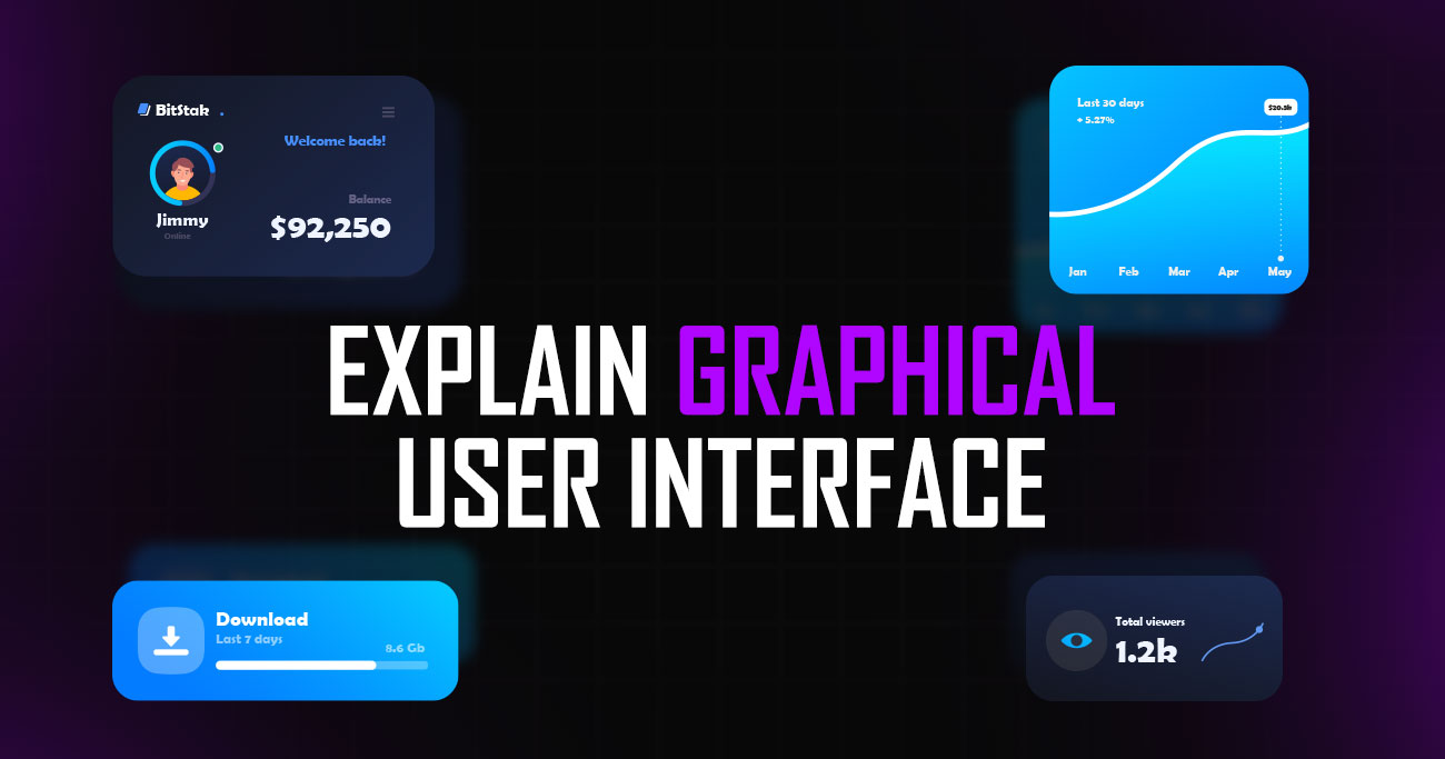
A graphical user interface, often called GUI, is the visual layer that allows people to interact with digital systems easily. Instead of typing commands, users can click buttons, tap icons, scroll pages, and navigate menus to complete tasks. GUIs are everywhere, from websites and mobile apps to operating systems and software tools.
They play a critical role in usability by reducing complexity and making technology accessible to non-technical users. Understanding how a graphical user interface works helps designers, developers, and businesses create products that feel intuitive and efficient.
Let’s explain the graphical user interface clearly, explore real-world examples, and break down how GUIs function behind the scenes to support smooth user interaction.
A Graphical User Interface (GUI) is the visual way people interact with digital products like websites, mobile apps, and software. Instead of typing commands, users can click buttons, tap icons, scroll pages, and use menus to complete tasks. GUIs are designed to feel intuitive, allowing people to understand how a system works without technical knowledge.
Common elements such as icons, windows, sliders, and forms guide users through actions familiarly and predictably. From smartphones and laptops to dashboards and web applications, GUIs make technology accessible to everyone. A well-designed graphical user interface reduces effort, prevents errors, and helps users achieve their goals faster by turning complex functions into simple, visual interactions.
A graphical user interface is built from structured visual components designed to support clarity, usability, and efficiency. Each element plays a specific role in helping users interact with digital systems confidently and complete tasks without unnecessary complexity.
Interactive controls such as buttons, input fields, switches, sliders, and checkboxes allow users to perform tasks directly within an interface. These elements replace text-based commands with visual interaction, making systems accessible to non-technical users. Clear labelling, predictable behaviour, and visible states such as hover, active, or disabled help users understand what actions are possible and prevent accidental errors during interaction.
Icons provide visual shortcuts that help users recognise actions and features quickly. Common symbols like search, delete, or settings reduce the need for reading and improve scanning efficiency. In professional GUI design, icons follow consistent visual styles and familiar metaphors. When used appropriately and supported with labels where needed, icons improve speed without sacrificing clarity.
Windows, cards, panels, and modal dialogs structure information into manageable sections. These containers help separate tasks, control focus, and reduce cognitive overload. In complex applications, well-defined containers allow users to concentrate on a single task while maintaining context. Proper spacing and hierarchy within containers improve comprehension and reduce visual clutter.
Navigation elements such as menus, sidebars, tabs, and breadcrumbs guide users through an interface. They provide a sense of location and make it easy to move between sections. Effective navigation reduces confusion, shortens learning curves, and ensures users can reach key areas without unnecessary steps. Consistency across navigation patterns is essential for usability.
Typography plays a critical role in how users consume information. Font choice, size, spacing, and contrast influence readability and scanning behaviour. A professional graphical user interface uses typography to establish hierarchy, highlight important actions, and guide attention. Clear text presentation ensures instructions, labels, and content are easy to understand across devices and screen sizes.
Feedback elements inform users when actions are recognised and processed. Loading indicators, hover effects, confirmation messages, and error alerts all contribute to feedback. Without visible responses, users may repeat actions or assume failure. Well-designed feedback improves confidence, reduces frustration, and increases trust in the system.
Layout determines how elements relate to one another on a screen. Consistent alignment, spacing, and grouping help users understand structure instantly. A well-organised layout reduces cognitive load, supports logical flow, and makes even feature-rich interfaces easier to navigate. Proper spacing also improves accessibility and overall visual comfort.
A graphical user interface works by translating complex system functions into visual elements that users can easily understand and interact with. Instead of requiring users to memorise commands, the interface presents actions through buttons, menus, icons, and other interactive components.
At the core of a GUI is the interaction between the user, the interface, and the system logic behind it. When a user clicks a button, taps an icon, or enters information into a field, the interface captures that input and sends it to the underlying software. The system then processes the request and returns a response, which the GUI displays visually, such as opening a new screen, showing updated data, or confirming an action.
Events play a key role in this process. Every interaction, whether it is a mouse click, keyboard input, or touch gesture, triggers an event. The GUI listens for these events and determines how the interface should respond. This event-driven approach allows interfaces to react instantly and feel responsive.
Visual feedback ensures users understand what is happening. Loading indicators, highlighted buttons, animations, and messages signal that an action has been received and processed. Without feedback, users may assume the system is unresponsive or broken.
Behind the scenes, layout rules and design systems control how elements appear and adapt to different screen sizes. This allows the same interface to function across desktops, tablets, and mobile devices. Together, these components enable graphical user interfaces to simplify interaction, reduce user effort, and make digital systems accessible to a broad range of users.
Graphical user interfaces can take different forms depending on the device, context, and type of interaction required. Each type is designed to match how users naturally interact with technology in specific environments.
Desktop GUIs are commonly used in operating systems and professional software. They rely on windows, icons, menus, and pointers to support multitasking and detailed workflows. This type of interface works well for complex tasks such as file management, data analysis, and creative work, where precision and screen space are essential.
Web GUIs operate inside browsers and power websites, dashboards, and web applications. These interfaces focus on clear navigation, responsive layouts, and cross-device compatibility. Since users may access them from different platforms, web GUIs are designed to adapt smoothly to various screen sizes and interaction methods.
Mobile GUIs are optimised for touch-based interaction. Larger buttons, simplified layouts, and gesture controls such as swiping and tapping are central to this interface type. The design prioritises speed, accessibility, and ease of use on smaller screens, making it suitable for everyday tasks and on-the-go usage.
Touchscreen interfaces are often used in kiosks, point-of-sale systems, and public displays. These GUIs are highly focused, with limited options and clear visual cues to guide users quickly through tasks without prior instruction.
Specialised GUIs are built for specific environments such as gaming, data visualisation dashboards, or industrial systems. These interfaces prioritise performance, real-time feedback, and task-specific controls over general navigation patterns, ensuring efficiency in specialised use cases.
A Graphical User Interface (GUI) and a Command-Line Interface (CLI) are two different ways users interact with computers and software. The main difference lies in how actions are performed and how much technical knowledge is required.
A GUI allows users to interact through visual elements such as buttons, icons, menus, and windows. Actions are performed by clicking, tapping, or dragging, which makes GUIs intuitive and easy to learn. Most modern systems, including websites, mobile apps, and operating systems like Windows and macOS, rely on graphical interfaces because they reduce learning time and improve accessibility for non-technical users. GUIs are ideal for tasks that involve exploration, visual feedback, and frequent user interaction.
A CLI, on the other hand, requires users to type text commands into a terminal or console. Each command must follow specific syntax rules, which makes CLIs harder to learn but very powerful once mastered. Developers and system administrators often prefer CLIs because they allow faster execution, automation, and precise control over systems. CLI tools also consume fewer system resources compared to GUIs.
From a performance perspective, CLIs are generally faster and more efficient, while GUIs prioritise usability and clarity. For most everyday users and businesses, GUIs are the better choice due to ease of use. CLIs remain valuable for advanced users who need speed, scripting, and system-level access.
In summary, GUIs focus on usability and visual interaction, while CLIs focus on efficiency and control.
Graphical user interfaces are widely used across everyday technology, helping users interact with digital systems visually instead of relying on commands or technical knowledge.
Operating systems are one of the most common examples of GUIs. Platforms like Windows, macOS, Android, and iOS use icons, menus, windows, and gestures to manage files, applications, and settings. Users can perform complex tasks such as multitasking or system configuration through simple visual actions.
Modern websites and web applications depend heavily on graphical interfaces. Navigation menus, buttons, forms, and interactive elements allow users to browse content, submit information, and complete transactions. Online stores, banking platforms, and SaaS tools all rely on GUIs to make digital services accessible.
Mobile apps are designed around touch-based graphical interfaces. Tapping, swiping, scrolling, and pinching are core interactions. Visual feedback, animations, and notifications help users understand actions quickly, even on smaller screens.
Design software, spreadsheets, project management tools, and media editors use GUIs to handle complex workflows. Toolbars, panels, drag-and-drop features, and visual indicators allow users to work efficiently without memorising commands.
Ticket machines, self-checkout systems, and information kiosks use simplified graphical interfaces. Large buttons, clear instructions, and focused layouts guide users quickly, even without prior experience or technical skills.
Graphical user interfaces offer clear advantages that make digital products easier to use, learn, and scale. By presenting actions visually, GUIs reduce complexity and help users interact with systems more confidently across devices and use cases.
One of the biggest benefits of a GUI is how easy it is to learn. Users do not need prior technical knowledge or training to get started. Visual elements such as buttons, icons, and menus guide users naturally, allowing them to understand how a system works simply by exploring it. This lowers the entry barrier and makes software accessible to a much wider audience.
GUIs allow users to complete tasks quickly by clicking, tapping, or dragging instead of typing commands. Visual cues reduce decision time and help users find actions instantly. For repetitive or everyday tasks, this speed improves productivity and reduces frustration, especially for users who interact with software frequently.
Visual interfaces help prevent mistakes by showing available actions clearly and disabling invalid options. Error messages, warnings, and confirmation prompts guide users before problems occur. Compared to command-line interfaces, GUIs reduce the likelihood of incorrect inputs, making systems safer and more reliable for everyday use.
Graphical user interfaces support accessibility features such as screen readers, high-contrast modes, larger text, and keyboard navigation. These features help users with visual, motor, or cognitive impairments interact with digital products more comfortably. A well-designed GUI ensures that more people can use a system without additional assistance.
When users can see what is happening on screen, they feel more in control. Visual feedback such as loading indicators, progress bars, and success messages reassures users that their actions are working. This transparency builds confidence and trust, especially in products involving payments, data entry, or sensitive information.
Modern GUIs are designed to work consistently across desktops, tablets, and mobile devices. Familiar patterns such as navigation bars, icons, and gestures help users switch between platforms without relearning the interface. This consistency improves user retention and reduces support needs for businesses.
A visually clear and responsive interface encourages users to explore features and stay engaged longer. Animations, transitions, and interactive elements make experiences feel smooth and enjoyable without being distracting. When users enjoy interacting with a product, satisfaction increases and long-term adoption becomes more likely.
Applying strong GUI design principles ensures interfaces remain usable, efficient, and consistent across different platforms and user groups. The following best practices help create graphical user interfaces that feel intuitive and professional.
Visual elements should communicate purpose, not distract users. Clean layouts, simple colour schemes, and clear labels help users understand what to do without confusion. Decorative elements should support usability, not compete with it.
Consistent placement of buttons, icons, colours, and typography helps users learn the interface faster. When patterns remain predictable, users can focus on tasks instead of figuring out how the system works on each screen.
Interfaces should follow familiar conventions users already know. Common icons, navigation patterns, and interaction behaviours reduce learning time and prevent frustration. Avoid reinventing patterns unless there is a clear usability benefit.
Every interaction should trigger visible feedback. Hover states, loading indicators, success messages, and error alerts reassure users that the system is responding. Feedback reduces uncertainty and improves confidence.
Information should be organised using visual hierarchy. Size, contrast, spacing, and alignment help users scan content quickly and identify what matters most. Fewer choices and clear groupings lead to better decision-making.
Accessible design benefits all users. Ensure sufficient contrast, readable text sizes, keyboard navigation, and compatibility with assistive technologies. Accessibility should be integrated early, not added as an afterthought.
Design assumptions should be validated through usability testing. Observing real users interacting with the interface helps identify friction points and improve clarity. Continuous refinement leads to more effective and user-friendly GUIs.
Even well-intentioned designs can fail when core usability principles are overlooked. The following mistakes are common in GUI design and often lead to confusion, frustration, and poor user adoption.
Trying to show everything at once is a frequent mistake. Crowded interfaces overwhelm users and make it harder to focus on key actions. When too many elements compete for attention, users slow down or abandon tasks altogether. Clear prioritisation and progressive disclosure help avoid this issue.
Inconsistency in buttons, colours, typography, or interactions forces users to relearn the interface repeatedly. When similar actions behave differently on different screens, trust decreases. Consistent patterns help users build familiarity and move confidently through the product.
When everything looks equally important, nothing stands out. Weak hierarchy makes it difficult for users to know where to look first or what action to take next. Proper use of size, contrast, spacing, and alignment guides attention and improves decision-making.
Interfaces that do not clearly respond to user actions create uncertainty. Missing loading states, unclear errors, or lack of confirmation can make users think something is broken. Visual feedback is essential for reassurance and smooth interaction.
Visually impressive interfaces can still fail if they are hard to use. Small text, low contrast, or decorative layouts often harm readability and accessibility. Good GUI design balances visual appeal with clarity and function.
Ignoring accessibility limits who can use a product. Poor contrast, tiny touch targets, or missing keyboard support create barriers for many users. Accessibility should be part of the design process from the start, not an afterthought.
Assuming users will understand the interface without testing is risky. Many usability issues only appear when real users interact with the product. Regular testing helps catch problems early and improves overall experience.
Graphical user interfaces play a central role in both web and mobile applications, shaping how users interact with digital products on a daily basis. While the core principles remain the same, clarity, usability, and feedback, the way GUIs are implemented differs slightly between platforms due to device constraints and user behaviour.
In web applications, GUIs are designed to work across multiple screen sizes and input methods. Navigation menus, forms, buttons, and interactive components must adapt smoothly from large desktop screens to smaller tablets and laptops. Consistency, responsiveness, and performance are key, as users often switch devices while expecting the same experience. Web GUIs also rely heavily on visual hierarchy and layout structure to guide users through content-rich environments.
Mobile applications, on the other hand, are built primarily for touch interaction. Interfaces prioritise simplicity, larger touch targets, and gesture-based controls such as swiping or tapping. Limited screen space forces designers to focus on essential actions and reduce visual clutter. Feedback through animations, transitions, and notifications becomes even more important to reassure users during interactions.
Across both platforms, a well-designed graphical user interface improves usability, reduces learning time, and increases engagement. By adapting GUI patterns to each environment, designers ensure users can interact comfortably, regardless of device.
Designing effective graphical user interfaces requires tools that support clarity, collaboration, and precision. Modern GUI design tools help designers move from early ideas to high-fidelity interfaces while staying aligned with developers and stakeholders. Below are some of the most widely used tools in professional GUI design.
Figma Figma is one of the most popular GUI design tools today. It is browser-based and supports real-time collaboration, making it ideal for teams. Designers use Figma to create wireframes, high-fidelity UI designs, interactive prototypes, and design systems. Its component and auto-layout features help maintain consistency and scalability across interfaces.
Sketch Sketch is a long-standing GUI design tool primarily used on macOS. It is well known for its simplicity and focus on interface design. Sketch supports symbols, reusable components, and plugin integrations, making it suitable for structured UI workflows. Many teams still rely on Sketch for web and product interface design.
Adobe XD Adobe XD is used for UI design, prototyping, and basic user testing. It integrates well with other Adobe products like Photoshop and Illustrator, which is helpful for teams already working within the Adobe ecosystem. XD allows designers to create interactive prototypes and share designs for feedback easily.
Framer Framer bridges the gap between design and development. It is often used for advanced prototyping and interactive UI design. Framer allows designers to create realistic interactions and animations that closely mimic real product behaviour. This makes it useful for testing complex user flows and micro-interactions.
Axure RP Axure is commonly used for UX-heavy projects that require detailed logic, conditions, and documentation. It supports advanced wireframing, dynamic content, and interactive prototypes. Axure is often chosen for enterprise systems and complex workflows where functionality needs to be clearly defined before development.
Balsamiq Balsamiq focuses on low-fidelity wireframing. It is used early in the design process to explore structure and layout without visual distractions. Its simple, sketch-like style helps teams focus on functionality and user flow rather than aesthetics.
Graphical user interface design continues to evolve as technology, user behaviour, and expectations change. Future GUI trends focus on making interactions more natural, efficient, and inclusive while reducing complexity for users.
One major trend is the growing use of AI-assisted interfaces. Artificial intelligence is increasingly helping interfaces adapt to user behaviour in real time. Personalised layouts, predictive actions, and smart recommendations allow GUIs to respond dynamically instead of remaining static. This reduces friction and helps users reach goals faster with fewer steps.
Voice and multimodal interaction is also shaping the future of GUI design. Interfaces are no longer limited to clicks and taps. Voice input, gestures, and visual feedback are being combined to create more flexible interactions. This trend is especially important for accessibility and hands-free use, allowing users to interact in different ways depending on context.
Another important direction is minimal and content-focused design. Interfaces are becoming cleaner, with fewer distractions and clearer hierarchy. Designers are focusing on removing unnecessary elements and emphasising essential actions. This approach improves usability and reduces cognitive load, particularly in complex products.
Motion and micro-interactions will continue to play a larger role. Subtle animations help users understand transitions, system status, and cause-and-effect relationships. When used thoughtfully, motion improves clarity and feedback without overwhelming users.
Cross-platform consistency is becoming increasingly important. Users expect seamless experiences across web, mobile, and other devices. Design systems and component-based approaches help maintain visual and behavioural consistency while allowing flexibility for different platforms.
Finally, accessibility-first design is no longer optional. Future GUIs are being built with inclusivity in mind from the start. Support for assistive technologies, adaptable layouts, and clear contrast will become standard practice rather than special features.
The main purpose of a graphical user interface is to make digital systems easier to use through visual interaction. By using buttons, icons, menus, and layouts, a GUI allows users to complete tasks without needing technical knowledge or memorising commands.
A GUI enables interaction through visual elements, while a command-line interface requires typed commands. GUIs are more intuitive and accessible for most users, whereas CLIs offer speed and control for advanced or technical users.
Graphical user interfaces reduce confusion and effort by presenting information clearly. Visual feedback, structured layouts, and familiar patterns help users complete tasks faster and with fewer errors, improving overall satisfaction.
No. GUIs are used across operating systems, desktop software, kiosks, dashboards, gaming platforms, and smart devices. Any system that relies on visual interaction can benefit from a graphical interface.
Yes. Poor GUI design can frustrate users, increase errors, and lead to abandonment. Even powerful products may fail if users struggle to understand or navigate the interface effectively.
Well-designed GUIs support accessibility by offering readable text, proper contrast, keyboard navigation, and compatibility with assistive technologies. Accessibility-focused design helps more users interact comfortably.
Graphical user interfaces are expected to evolve rather than disappear. While voice, gesture, and AI-based inputs will grow, GUIs will continue to provide essential visual structure and clarity for digital interactions.


Sakib Al Hasan
Leave a Reply