 Sakib Al Hasan
In 2025, first impressions matter more than ever. Your website has just a blink to win people over. Studies show that visitors form an opinion in about 50 milliseconds, and 94 percent of them say poor design makes a site feel untrustworthy.
At the same time, more than 60 percent of all web traffic now comes from mobile devices. This means your layout must not only look good but also work smoothly on small screens. In this post, you will find 15 practical and effective layout tips that make your site clear, modern, and trustworthy from the very first moment someone lands on it.
First impressions online happen in a blink. A clear and well-structured website layout helps visitors stay, trust your brand, and engage longer. These 15 tips will guide you to create modern, user-friendly designs.
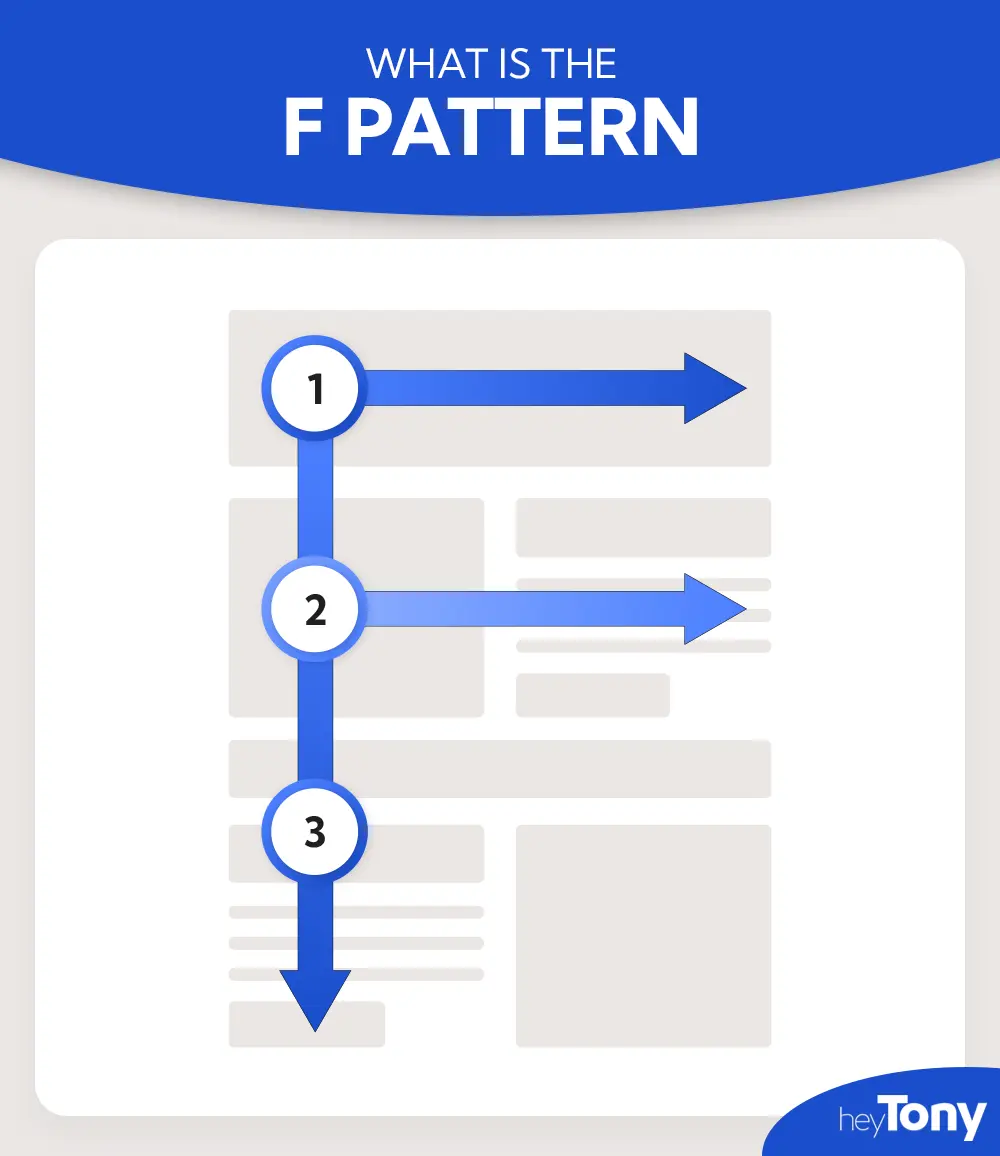
Browsers and eyetracking studies show that people often scan web pages in an “F” shape: starting at the top-left, moving across, then going down the left side, and occasionally scanning again. This behavior suggests that key messages, headings, or call-to-actions placed in these areas are more likely to be noticed first.
Example:Imagine you land on a blog article. At the very top, you'll see the title and navigation—perfect for catching the eye immediately. Then, as you move down, you'll notice the subheading or image that draws you in. Finally, scanning along the left margin, you might spot bullet points or bold phrases. If you want to guide users to sign up, a brightly colored button placed in the left center could be clicked faster.
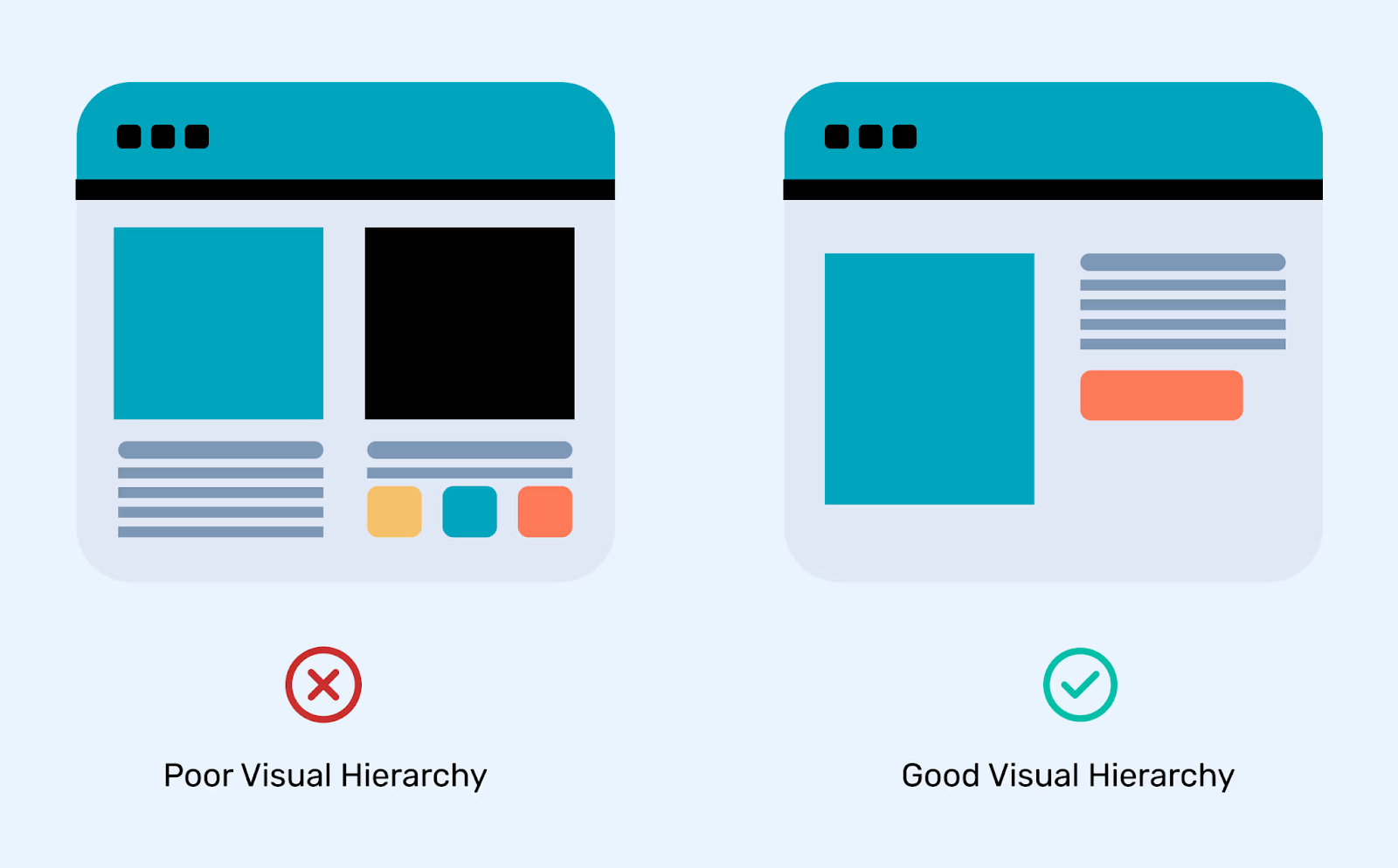
Visual hierarchy is all about guiding someone's eyes using elements such as size, color, or spacing. Big, bold headlines catch attention first, followed by more minor headings or subtle details. It's about arranging elements so your message stands out naturally.
Example:Consider a modern agency homepage. You'd open the page and spot a bold headline front and center—maybe something like “We Craft Digital Experiences.” Beneath it, a smaller sentence gives more context—something like “Design that clicks and converts.” Then, a bright button labeled “View Our Work” stands out due to its color and placement. It's a smooth, intentional journey for your eyes.
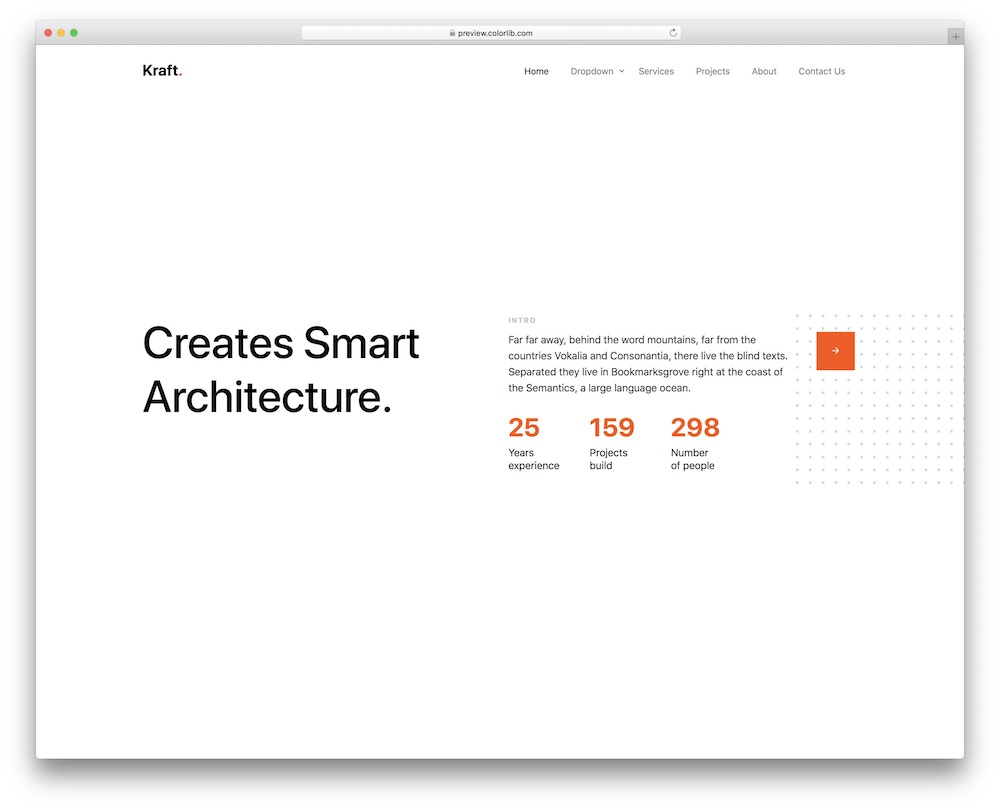
A clean, simple homepage helps people grasp your message fast. Without too many elements fighting for attention, what's essential shines. To get people to act, think of a clean layout, a brief headline, one button, and a clear visual signal.
Example: Imagine landing on an agency's homepage that simply states “We make brands memorable” at the center. Under that, a short line: "Bold design meets smart strategy.” And just one button: “See Our Projects.” That's it. No extra menus or clutter—just the essentials, making it easy for you to know what to do next.
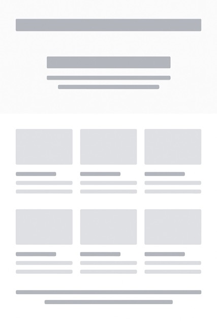
A grid is one of the most reliable tools for creating a professional website layout. It is like the skeleton that keeps everything else in place. When you design with a grid, elements fall into neat rows and columns, which creates order and balance. Visitors do not have to guess where to look next because the design naturally guides their eyes.
Grids also save you time. Once the structure is in place, you can design faster without worrying about uneven spacing or messy alignment. Developers love grids too, because a consistent layout is more straightforward to code and maintain. A grid-based design makes sure your site feels clean, intentional, and trustworthy.
Example: A portfolio page that shows project cards in three equal columns. Each card lines up perfectly with the next one, creating harmony across the whole page.
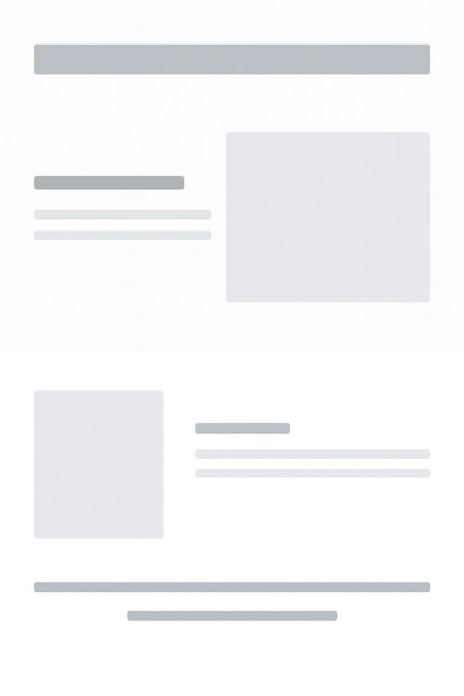
Even though grids bring order, sometimes breaking out of them creates more excitement. Asymmetry gives a website energy. Instead of keeping everything perfectly balanced, you can place a bold image on one side and text on the other in a way that feels slightly uneven. This kind of design captures attention because it looks different and fresh.
The key is to use asymmetry in a controlled way. If everything looks off balance, the design becomes confusing. But if you choose one or two sections to break the grid, it makes those parts stand out. It is like a surprise twist that keeps the visitor curious without making the page hard to follow.
Example: A blog homepage with text neatly aligned on the left and a striking image that overlaps the right side of the screen. The difference makes the page feel modern and engaging.
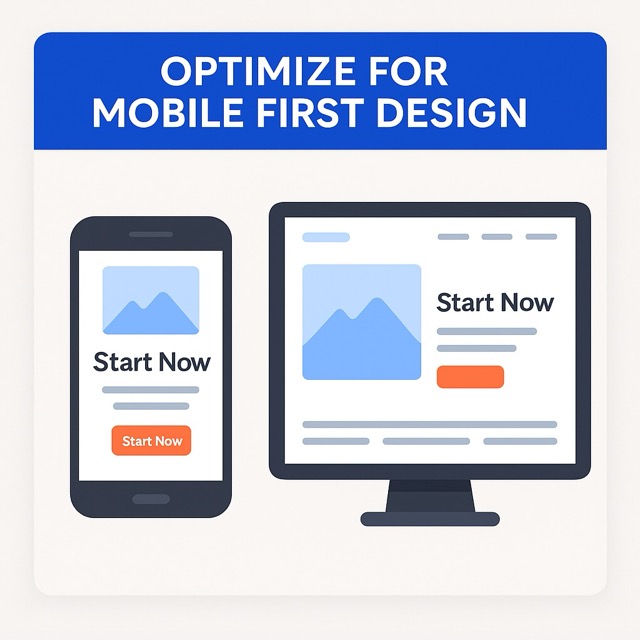
Most people today browse websites on their phones. That is why mobile-first design has become so important. You start by designing the miniature screen version of the site. Space is limited, so you are forced to focus on what matters, like a clear headline, one call to action, and an image that supports the message.
Once you have the mobile layout working well, you can expand it for larger screens. On a desktop, the same design can spread into more sections, bigger images, and extra details. This approach makes sure your site is straightforward and fast on phones, while still looking complete on bigger devices. It also helps with search rankings and user satisfaction.
Example: On a mobile landing page, you see one bold headline and a simple button that says "Start Now." When viewed on a desktop, the same page shows a navigation menu and supporting visuals without losing the primary focus.
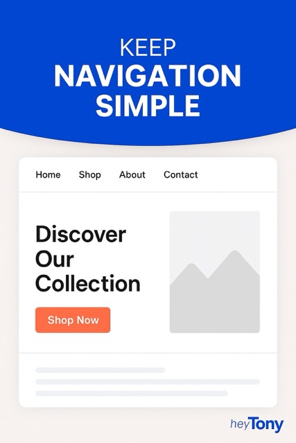
Navigation is like a roadmap for your visitors. If it's too complicated, people leave before they even get to know your site. A simple menu makes browsing stress-free. The fewer options you give, the easier it is for users to choose. Try sticking to the essentials in your main navigation and move other details into the footer or a secondary menu. Consistency matters here, too. Keep navigation in the same place on every page to help users stay organized.
Example: Imagine a clothing store website with only four menu items — Home, Shop, About, and Contact. It feels clean, and you know exactly where to go without overthinking.
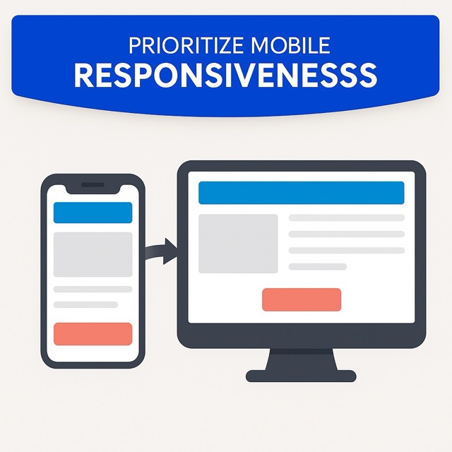
These days, more people browse on their phones than on desktops. That means your website should look and work great on any screen. A mobile-responsive design automatically adapts to smaller screens. No one likes zooming in or scrolling sideways to read text. Buttons should be big enough to tap easily, and layouts should stack vertically for smooth scrolling. A mobile-first mindset makes sure your site performs well for everyone, no matter what device they use.
Example: Think about Instagram. On desktop, it's wide and spacious, but on mobile, everything is stacked in a neat flow that fits perfectly on a phone screen. That's what you should aim for.
Whitespace isn't wasted space. It's what makes your design breathe and feel balanced. When you pack too much content close together, it overwhelms the visitor. Strategic use of whitespace draws attention to the things that matter, like buttons, headlines, or calls to action. It also improves readability and makes your site feel modern. Don't be afraid of space — it helps guide the eye in a natural flow across the page.
Example: Apple's website is the perfect example. A single product often sits in the center of the page surrounded by lots of space. That space directs all focus to the product.

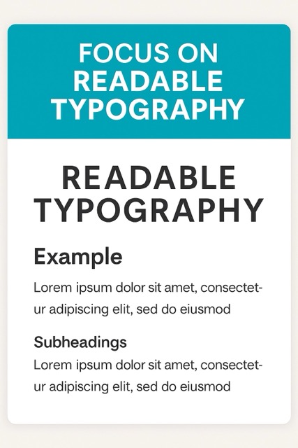
Words carry your message, so how they look matters. A website with fonts that are too small or too fancy can make visitors lose interest quickly. Stick with clean, legible fonts that are easy on the eyes. Your body text should be big enough to read without squinting, and headlines should stand out clearly. Line spacing is another secret weapon. Giving text a little breathing room makes reading more comfortable and keeps people engaged longer.
Example: Picture an online journal with articles written in a neat sans serif font, sized large enough for mobile screens. The paragraphs are spaced just right, and the subheadings are bold and slightly bigger. Reading feels effortless, so you end up staying on the site longer.
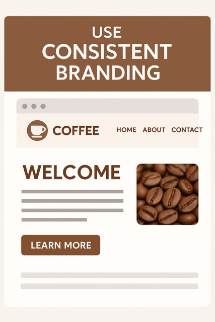
Consistency builds trust. When your colors, fonts, and style stay the same across your pages, the whole site feels professional and reliable. Random changes in colors or button styles can confuse visitors or make your design feel messy. Your brand should come through in every corner of the site, from the logo placement to the way images are edited. Your website is like your virtual wardrobe. Make sure it's well-organized and polished so people will remember you.
Example: Imagine a coffee shop website where the same warm brown color shows up on buttons, borders, and even headings. The fonts match the vibe of their menu in-store, and photos of coffee beans have the same earthy filter. Everything feels like it belongs together, and that makes the brand stronger.
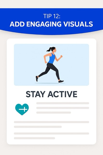
Visuals are the heartbeat of a layout. A wall of text can feel heavy, but a few well-placed images, icons, or illustrations bring life to the page. Photos should be high quality and relevant to what you're saying. Graphics like arrows or icons can also guide the eye and add personality. The trick is balance. Too many visuals can clutter the layout, while just the right amount keeps things fresh and engaging.
Example: Let your mind wander to a fitness website where vibrant, animated photos of people exercising adorn every page. Underneath, a small icon like a dumbbell or a heart symbol emphasizes key points. Together, these visuals make the content easy to skim and more fun to explore.
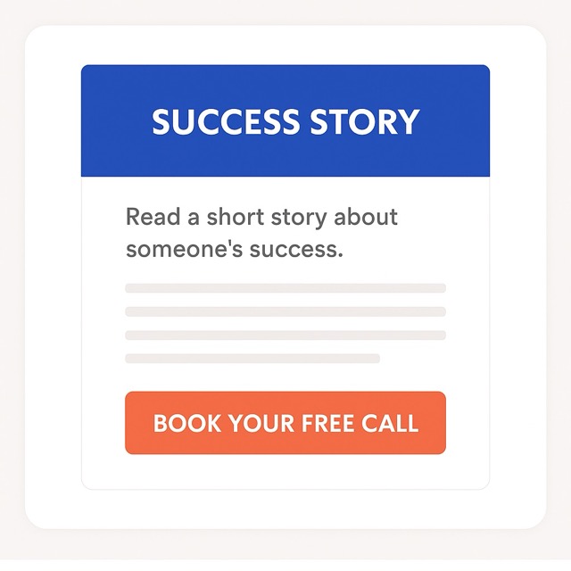
A great layout doesn't just look good. It nudges people to take action. That's why the placement of buttons or calls to action is so important. Your visitors should never have to hunt for what to do next. Buttons should stand out and appear at natural points in the journey, like after a short description or near a headline. Avoid cluttering the page with too many actions. Instead, guide people step by step with one clear choice at a time.
Example: On a coaching website, you might read a short story about someone's success. Right under it, there's a button saying "Book Your Free Call." It feels natural because the story warms you up, and the button is exactly where your attention lands next.
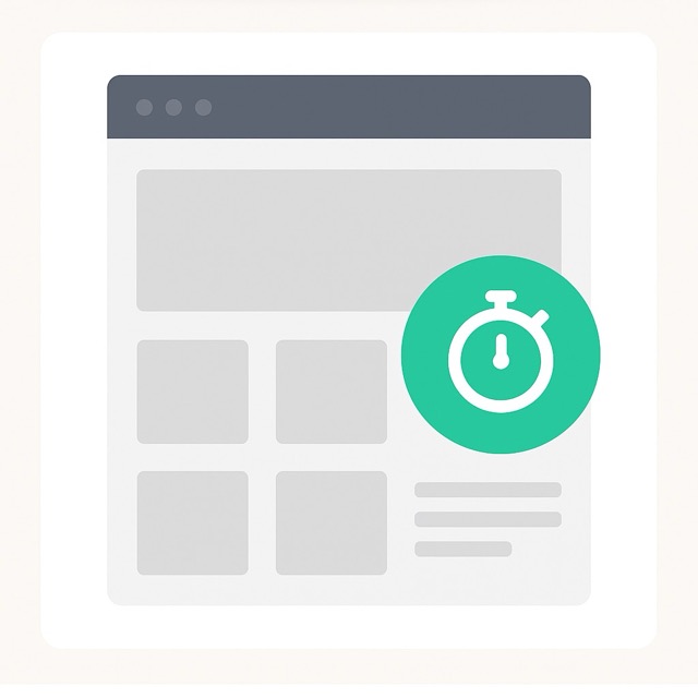
No one wants to wait for a site to load. A beautiful design loses its shine if it takes forever to appear. Speed is part of layout because heavy images, complex scripts, or cluttered designs can slow things down. A clean, simple structure not only looks good but also helps the site load faster. This keeps people from clicking away in frustration. To make your virtual house more inviting, it's like clearing the clutter before visitors arrive.
Example: A photographer's portfolio site might showcase big, bold photos. Instead of dumping them all on the homepage, the design uses a grid of smaller previews. Clicking on one opens the larger version quickly. The site feels sleek and fast, even though it's packed with visuals.
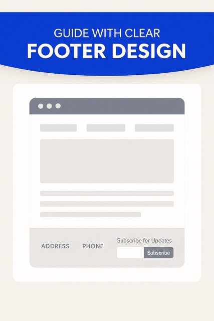
The footer is often overlooked, but it's like the safety net of your layout. When people scroll to the bottom, they expect to find key Information. A precise, well-designed footer keeps your site organized and user-friendly. Include essentials like contact info, links to social profiles, or a simple navigation menu. You can even add a call to action here for people who want to take the next step after browsing. Consider the footer as an unsung hero who subtly bolsters the main design.
Example: A small business website ends with a neat footer that has the address, phone number, and a short "Subscribe for Updates" form. Visitors don't have to scroll back up to find what they need. The layout feels complete and welcoming to the bottom.
A website layout is more than looks. It shapes how people feel, where they click, and whether they stay or leave. A clear layout creates trust, guides attention, and makes browsing enjoyable.
When visitors land on a website, they want to find answers fast. A simple layout with clear menus, headings, and pathways helps them move around without frustration. If people get lost, they leave. A smooth, predictable navigation experience gives users confidence and encourages them to explore more.
Research shows people form opinions about a website in just milliseconds. The layout is the first thing they notice, even before reading the text. A messy or cluttered design feels unprofessional, while a clean and balanced one feels trustworthy. That initial trust can decide whether someone stays or clicks away.
Good layouts act like a map for the eyes. Using spacing, hierarchy, and design patterns, you can guide people toward what matters most, like a sign-up button or key message. Without structure, important content gets lost in noise. A thoughtful layout directs attention smoothly without overwhelming the visitor.
Over 60 percent of web traffic now comes from mobile devices. If a layout doesn't adapt, users will struggle with tiny buttons and sideways scrolling. A mobile-responsive design makes Information easy to access, improves satisfaction, and keeps people coming back. It shows you respect their time and device.
Whitespace isn't space. It's a design tool that makes pages easy to scan and comfortable to read. When elements are crowded, people feel stressed. Strategic use of whitespace helps the layout feel balanced, draws focus to essential details, and gives the overall design a modern, calm tone.
Even the best websites can fail if the layout feels confusing. Many mistakes seem small, but they drive visitors away fast. Avoiding these common errors helps your site feel transparent, modern, and trustworthy.
Too many elements on one page overwhelm visitors. When ads, pop-ups, and endless blocks of text fight for attention, people lose focus. A clean and balanced design makes your message stand out and keeps users engaged longer.
A layout that looks fine on desktop but breaks on mobile is one of the biggest mistakes today. Over half of visitors browse on phones. If they need to zoom or scroll sideways, they leave. Every layout should adjust smoothly to all screen sizes.
When colors, fonts, and button styles change from page to page, the site feels unprofessional. Visitors might even wonder if they ended up on a different website. Consistency builds trust. Keeping branding elements the same across your site makes it feel polished and reliable.
Confusing or overloaded menus frustrate people quickly. If it takes more than a few seconds to figure out where to go, many users will exit. A clear, simple navigation bar with only essential options keeps browsing easy and stress-free.
Even the most beautiful design fails if it loads too slowly. Heavy graphics, oversized images, and unnecessary code drag performance down. Studies show that visitors leave if a page takes more than three seconds to load. A faster site layout always feels better.
Layouts are evolving fast, driven by innovation and user expectations. Expect more interactivity, responsive design, personalization, AI tools, and brand‑safe creativity. Here's what's shaping tomorrow's web experience.
We're moving past flat, static designs. Tiny animations—like button ripples, hover highlights, or gentle loading effects—bring pages to life. These micro‑interactions offer feedback, make the experience feel polished, and subtly guide visitors without overloading their senses.
Layouts are breaking free from rigid grids. Floating or hovering objects—what some call the "UFO effect"—make pages feel dynamic and fun. These design moments add personality, lighten the experience, and catch attention in fresh ways.
Bright minimalism isn't the only path forward. We're seeing warm, nature‑inspired designs with earthy colors and organic shapes, as well as nostalgic styles like retro typography or sketchy, human‑made visuals. These trends help websites feel more expressive and personal.
Instead of static content, sites are becoming playful environments. Think drag‑and‑drop animations, scroll‑triggered reveals, or immersive storytelling sections. These interactive elements encourage exploration and make interaction feel less like clicking and more like discovering.
Website design is also getting smarter. AI is now helping generate images and content, offering templates that adapt, and letting users edit live pages without code. This trend speeds up workflows and makes design more accessible while keeping the interface flexible.
A great layout is more than decoration. It builds trust, guides attention, and makes visitors feel comfortable. Every detail matters, from typography to whitespace to how you place calls to action. These 15 tips are simple but powerful steps to help your site stand out in 2025.
Keep your design consistent, make navigation easy, and always think about the experience of the person visiting your page. When your site feels clear, fast, and welcoming, people stay longer and engage more. Apply these ideas, and your website will not just look modern, it will genuinely connect with its audience.
What is the best way to test if my website layout works well?Ask real people to try it. Give them small tasks like finding a product or signing up. Watch where they click and where they hesitate. Heatmaps and recordings also help you see what gets noticed and what gets ignored. Even five testers can uncover big problems.
How often should I update my website layout?Review it at least once a year. Trends, devices, and user habits change fast. You may not need a complete redesign, but refreshing colors, reorganizing menus, or swapping images can keep things fresh. A bigger update may be required every few years.
Does using animations improve a website's layout?Yes, if they are subtle. Smooth scrolls, hover effects, or fade-ins can guide the eye and make the site feel alive. Heavy or flashy animations can slow things down and frustrate users, especially on mobile. Keep it simple and purposeful.
How do colors affect website layout?Colors shape mood and focus. Bright shades can highlight buttons or calls to action, while softer tones help with readability. Stick to a small palette for consistency. Too many colors make a site feel messy.
What role do images and text balance play in layout?Good layouts use both. Text gives clarity, while visuals make things engaging. Pair short, clear writing with supportive images so the message feels complete and inviting.
We Create Unique Digital Experiences For Global Brands By Integrating AI, Innovative Design, And Advanced Technology.


Sakib Al Hasan
Leave a Reply